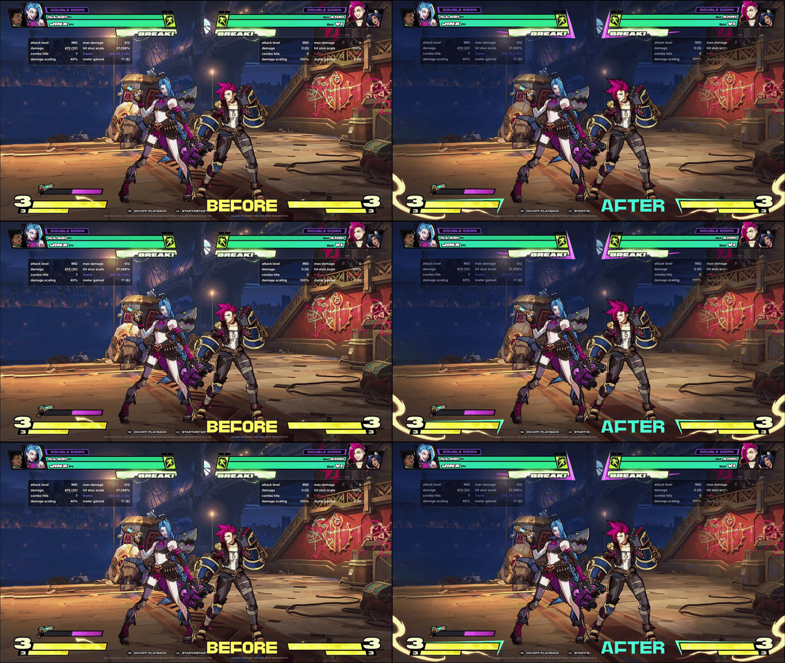
2XKO ART DIRECTION ANALYSIS
UI / HUD
Because this is a fast paced fighting game - the HUD elements are LARGE because the faster the game pace & the more things we’re paying attention to- the larger the UI elements need to be (if they’re at the periphery of your vision).
The UI is also quite contrasty compared to the background, which is in a much tighter (thinner) value band.
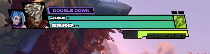
Aggressive, angled, easy to read shapes clearly communicate their function & also the feel of the game.
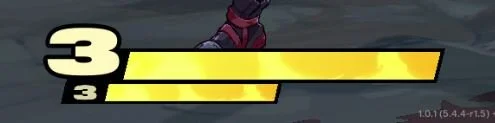
We have completely eliminated tertiary details - and only barely have secondary. The focus is on FAST READABILITY.
CHARACTERS
Characters are not only expressing personality & story - but they’re also designed for ease of development, & ease of tracking.
The style is SIMPLIFIED - with very minimal shading because of the complexity on screen in such a fast paced game - It’s stylized & exaggerated lineart with minor cell shading & strong poses.
Distinguishing body parts are easy to track in the player’s peripheral vision - & Designers have thought about animation tolerances (making sure collars etc aren’t too tight etc).
Most characters are shown in side view in game - & so are designed with this in mind.
You really only see elements that contribute to the silhouette or read of the character - everything else has been eliminated. (This reminds me of my mentor: use as few brush strokes as possible to communicate your idea!)
Characters in the marketing side of the IP tend to have STRONG RIM LIGHT which enhances their silhouette.
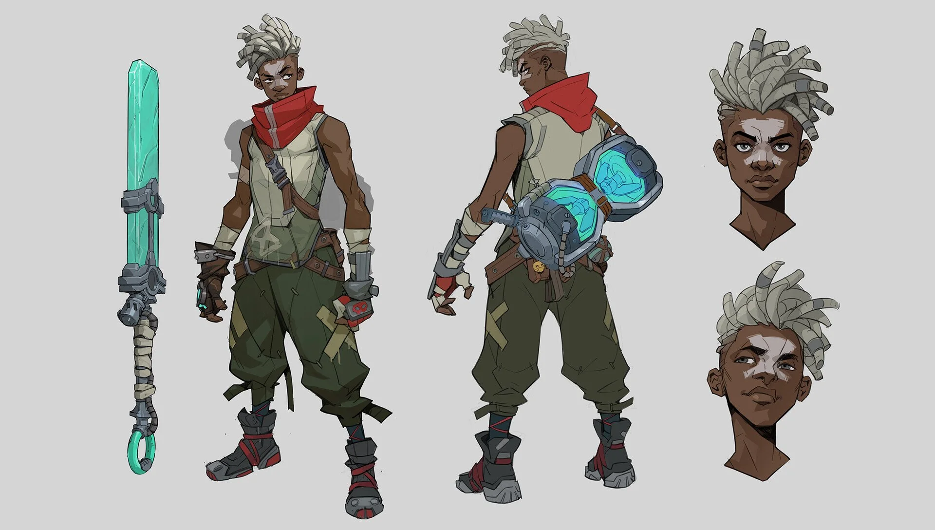
Characters always keep in mind the art direction & design of where they come from - & the players LORE & STORY.
Ekko (seen above) comes from a rough street background, and that reads in his design.
VFX
The VFX is also in a wider value / saturation band than the Environment Art - & boasts SIMPLE, EASY TO READ SHAPES with STRONG 1,2,3 proportions.
There is a strong use of hard brush, with softer edges coming in in reduced proportion.
Saturation deepens as we go darker in value, & we’re avoiding blacks & whites (for good reason!)
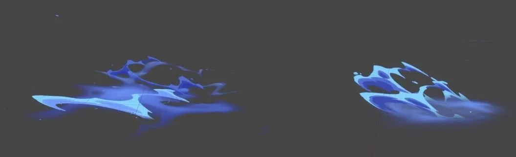
WHAT I’D SUGGEST IMPROVING
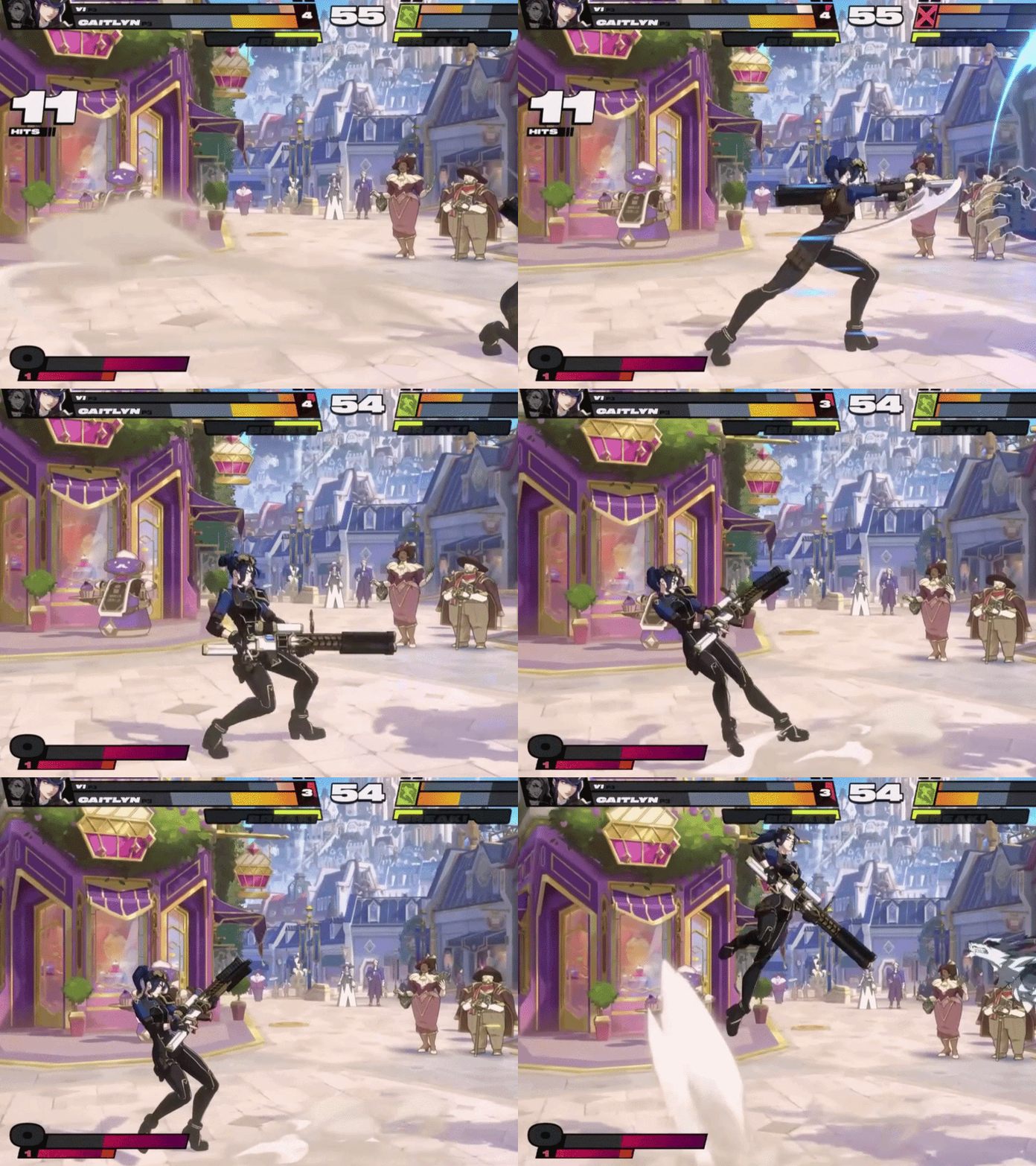
ANIMATION STALLS
In game - there are stalls for impactful
character moves in order to increase comprehension - but adding a slight falloff
on the movement without affecting timing would help it feel more polished & less jarring.
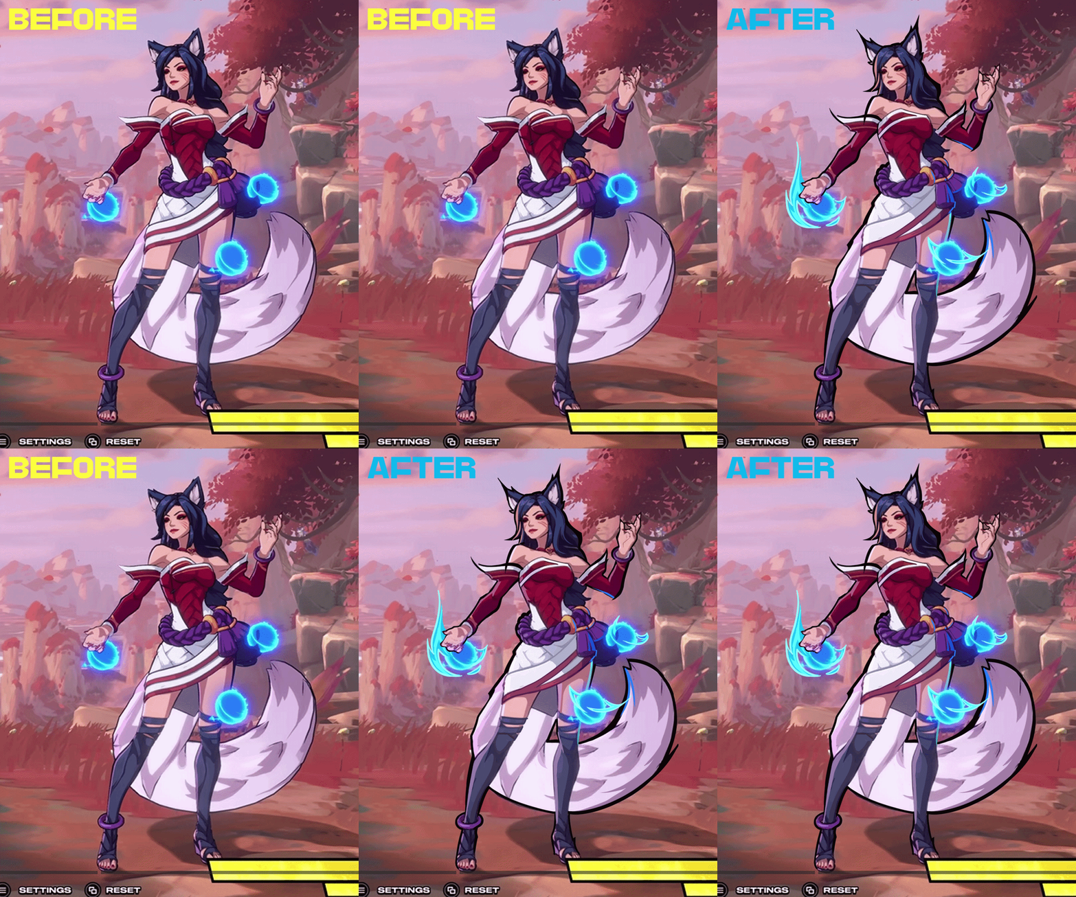
DESIGN READABILITY PASS
Reduce & combine details into larger groupings for ease & readability
Establish clearer rules (colored thin lineart in character interior, bold, uncolored lineart on exterior
Clear usage of established motifs / shape languages (I paired the shirt motif & skirt into 1 cohesive language)
Clarified silhouette
Carried wolf motif into VFX
Bolder rim lighting to create shape instead of line & integrate character in environment.
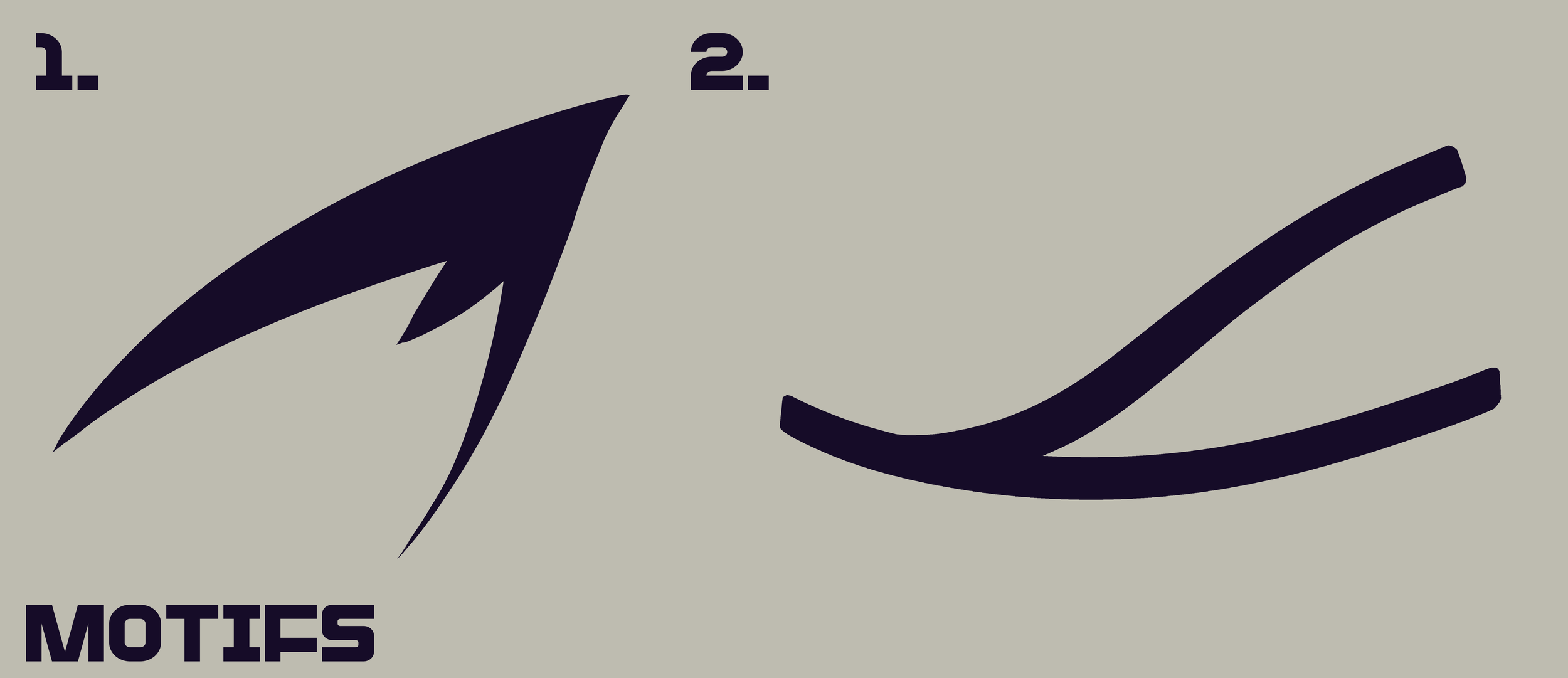
Motifs used on the above character edits for unification & clarity
BACKGROUND READABILITY PASS
Improved focus on main characters by reducing environmental noise
Corrected values
UI emphasis