
I spent 5 years of Art Directing a 16 person team & established the highly stylized, iconic world of Chernobog in an IMPRESSIONIST art style.
I oversaw establishing our style- Environment art, VFX, UI, Animation, our overall art pipeline development. I was also in charge of creating a unique & powerful team culture!
The art style was picked to match the core mechanic of the game: STORY GENERATION, which relies on APOPHENIA the same way an impressionist painting also leaves room for interpretation. A side effect was that impressionist assets are much faster to develop!
& finally, we were working in a CUSTOM ENGINE developed by our engineers.
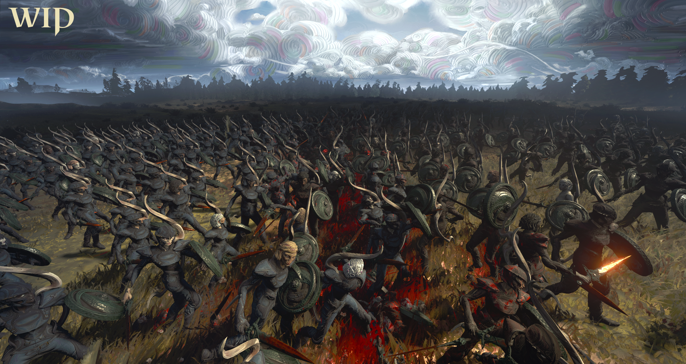
The goal was to develop a UNIQUE & MEMORABLE art style that could rely on the “purple cow theory” to cut through the vast swath of noise when marketing, & that fit our story/design goals.
IF YOU SEE OUR STYLE ONCE, YOU ALWAYS KNOW IT.
Everything in our world is textured based on some form of traditional art: impasto oil painting, clay sculpture (where you can see the fingerprints still), inkwork, etc.
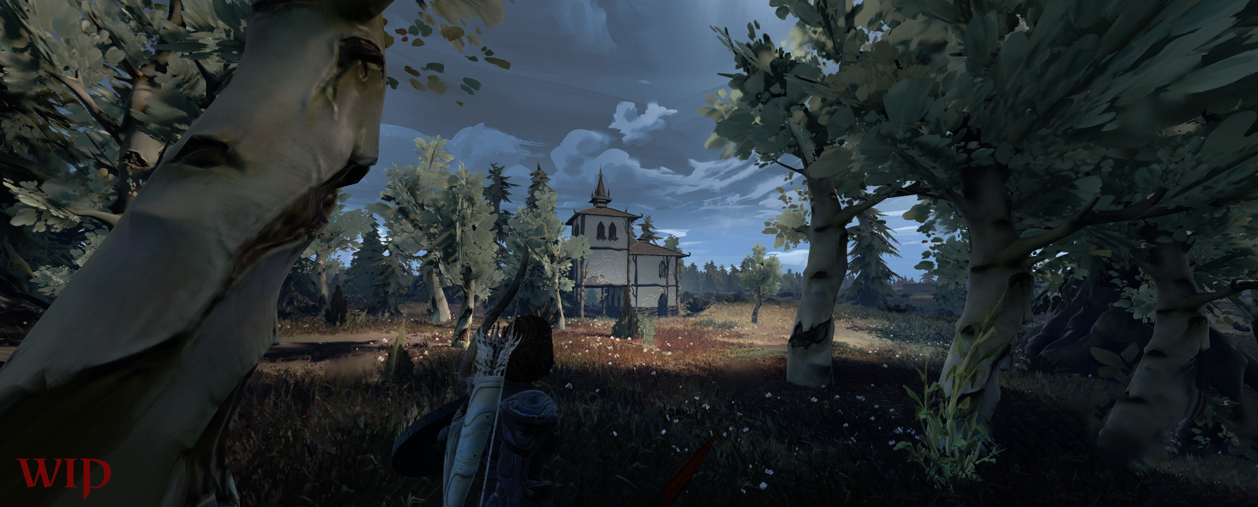
THIS GAME IS A WORK IN PROGRESS; NOTHING IS POLISHED YET.
CREATURES
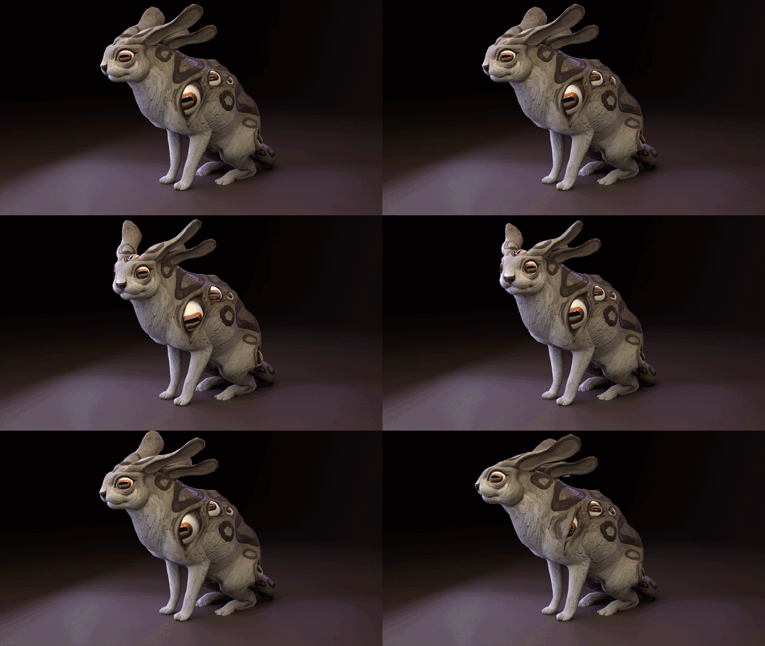
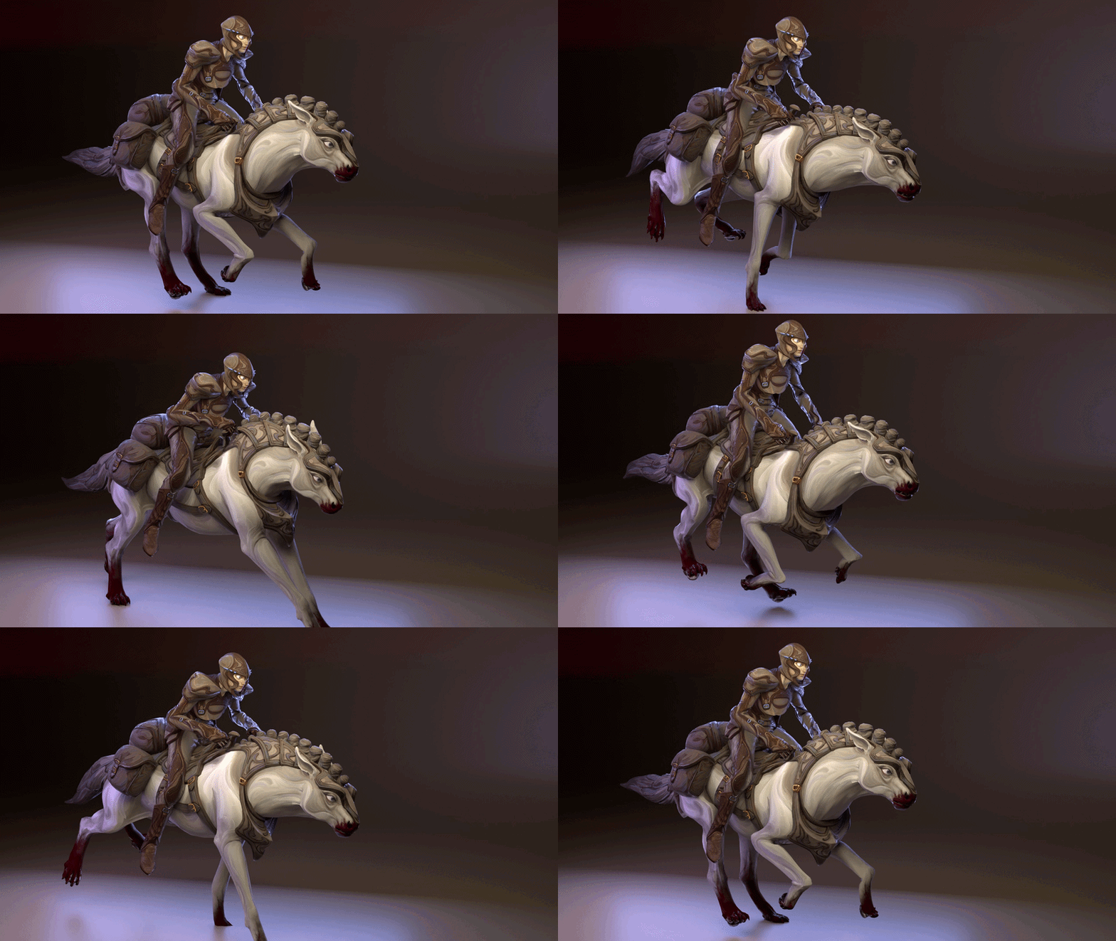
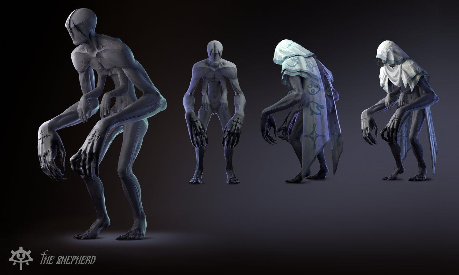
Every creature in this game was designed to be self similar & threatening. Horses eat the bodies of felled foes.. Kibbets curse you if you are unlucky enough to kill one.. “Deer” suck your blood from your body like a leech.
Each design follows the rules of the IP:
Desaturated (unless a focal threat),
Impasto,
Impressionist,
Stylized,
Predatory,
& with minor faceting & exaggeration of underlying anatomy.
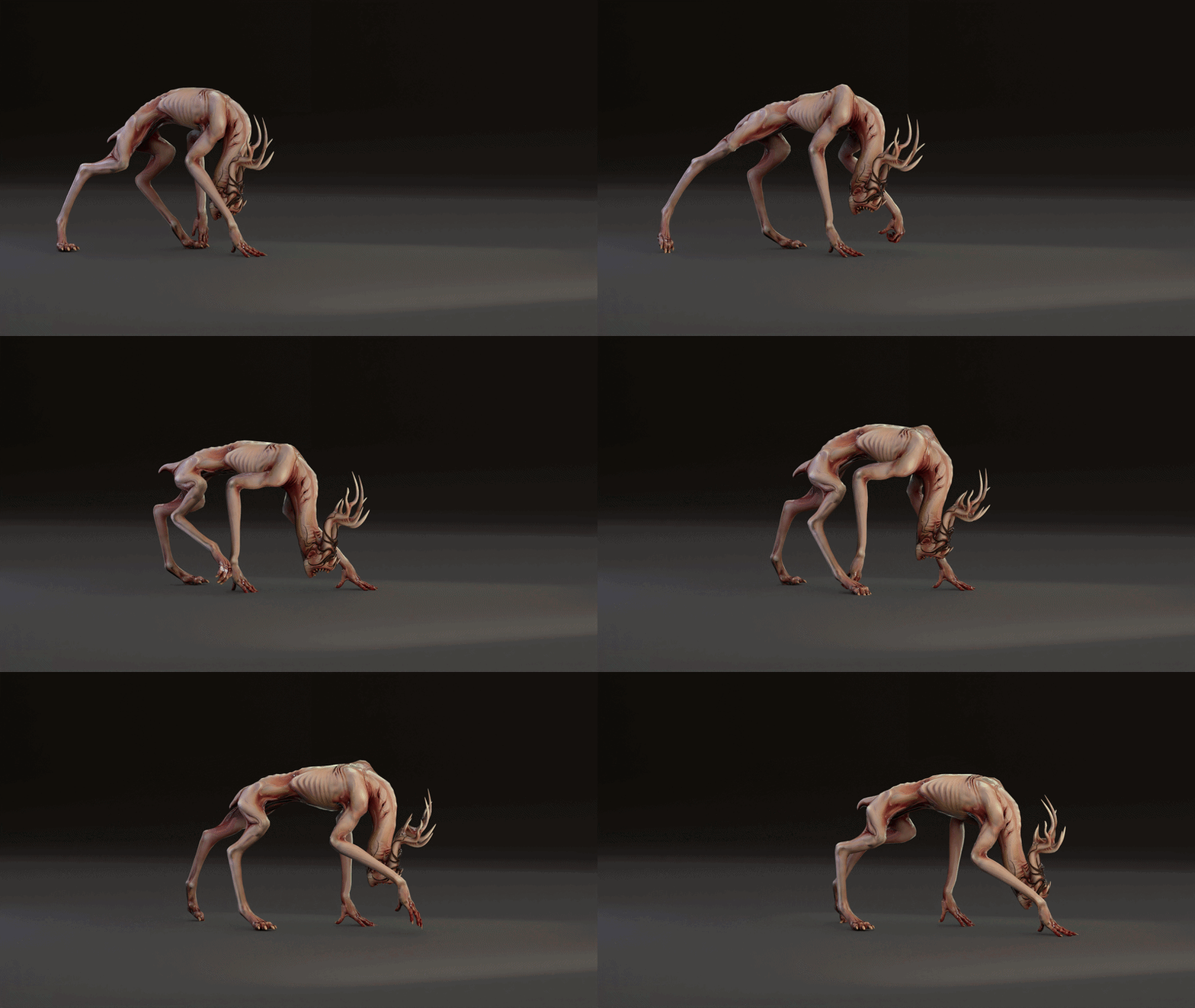
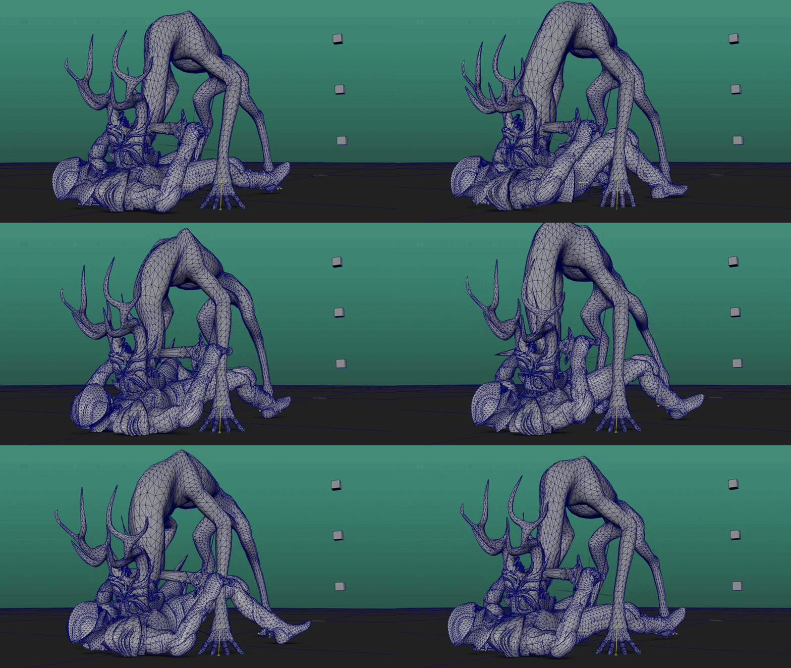
Our team had 2 wonderful animators: Rohan Jack & Artur Hvang, who took feedback excellently & took our weird asks in stride!
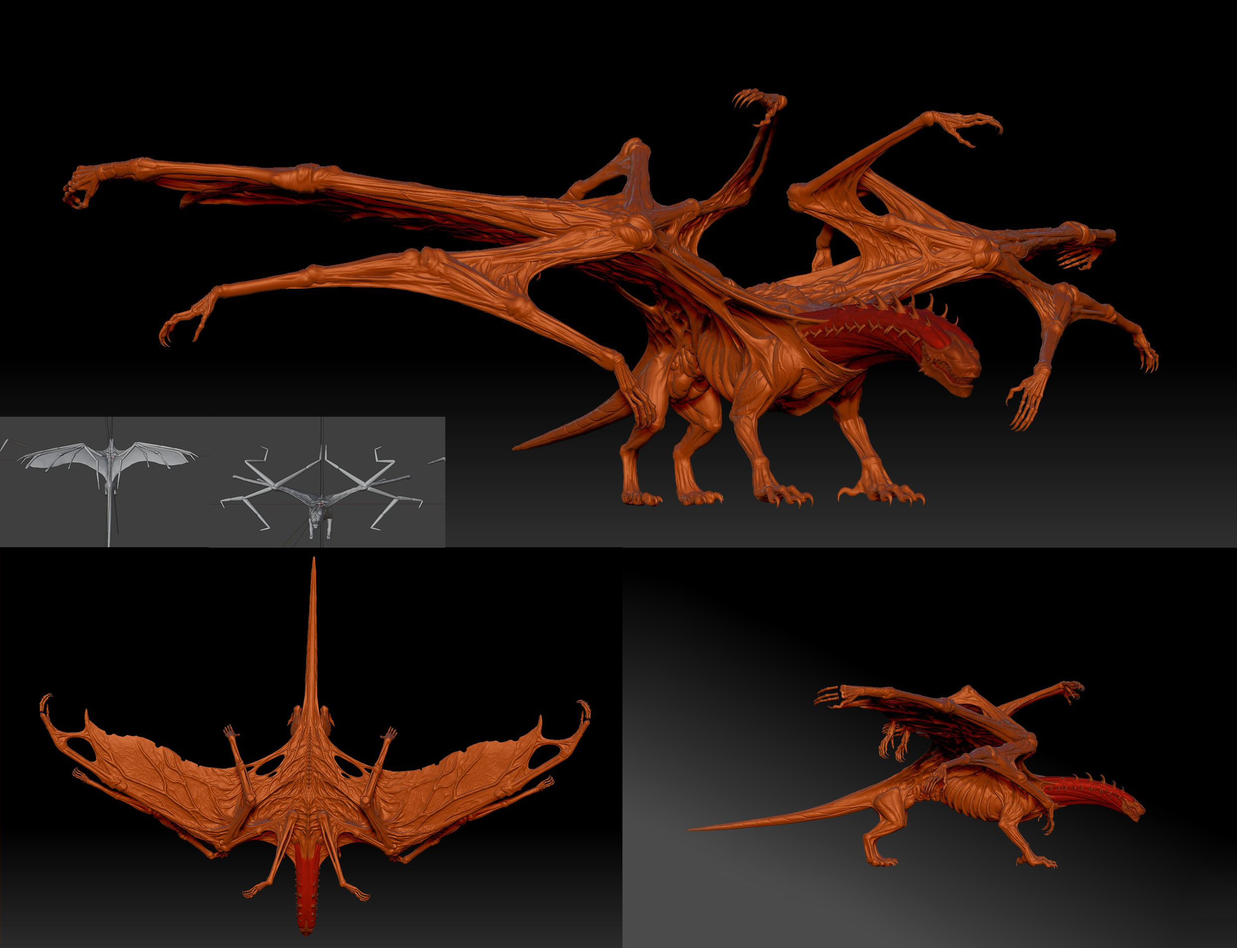
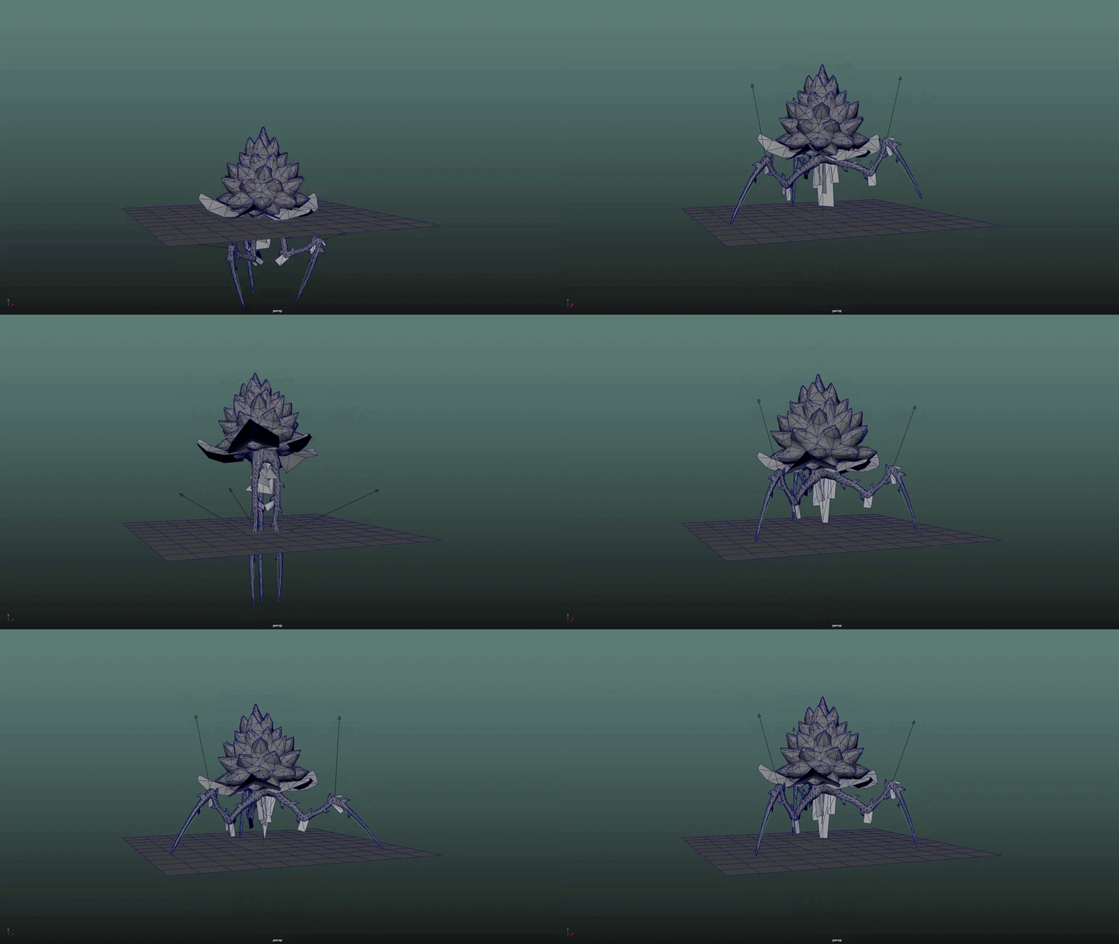
Our dragon casts spells with its many arms - but the arms collapse down perfectly so he can still fly.
His head splits into 4 & he vomits blood that he uses for spellcasting (gross!). This is all fully rigged & functional, one of our animators is currently bringing him to life!
ENVIRONMENT ART
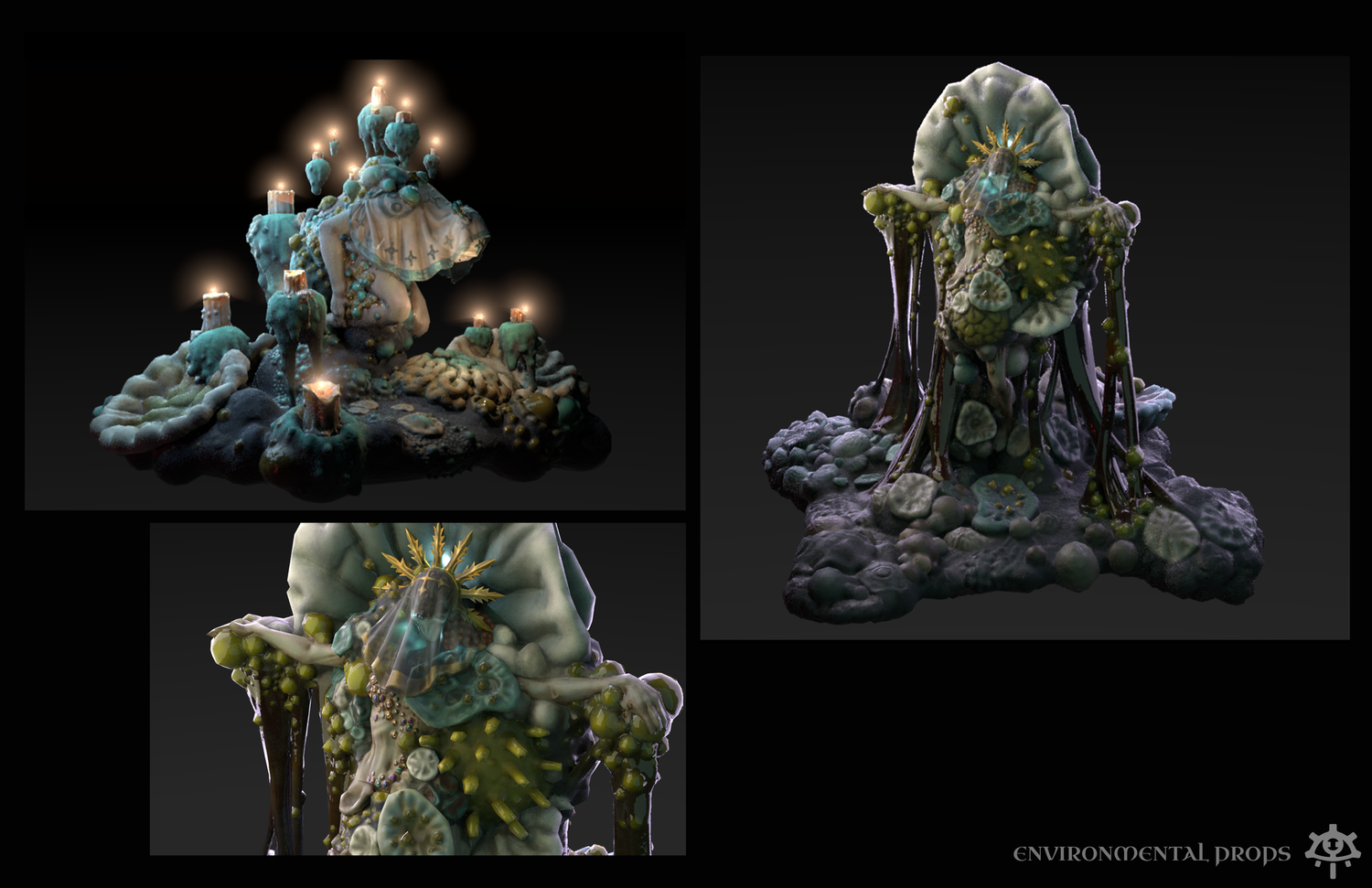
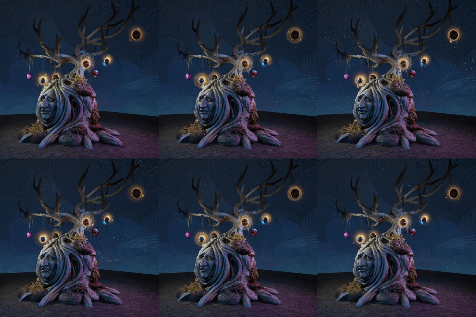
Chernobog is one of 2 competing forces that dynamically change the landscape: He is the god of Apathy, & the voice in your head (i mean you!) when you think getting out of bed is pointless.
We designed Chernobog’s aesthetic to be based on mold.. something that grows insidiously within- & catholic themes.
Banshira, by contrast, is the god of ruthless power seeking. Her visual language is flesh.. overgrown skin.. & cities overgrow into flesh cities when corrupted by her presence.
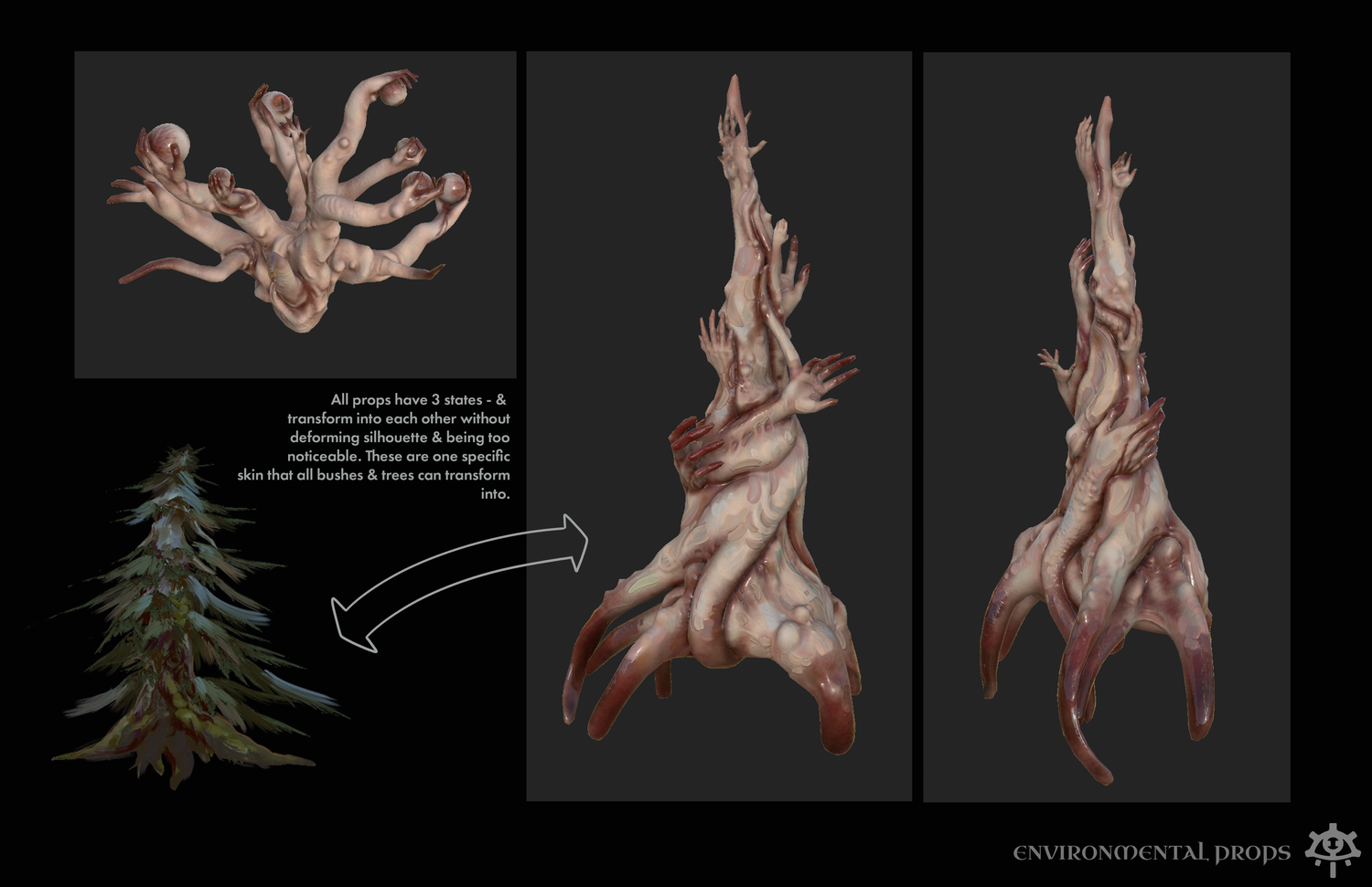
Because each physical asset in our game can corrupt into 2 other states (3 total) - we designed a COLLAPSING SYSTEM: all veggies corrupt into 1 banshira veggie, etc. This kept scope manageable while still creating enough biome diversity.
CHARACTERS
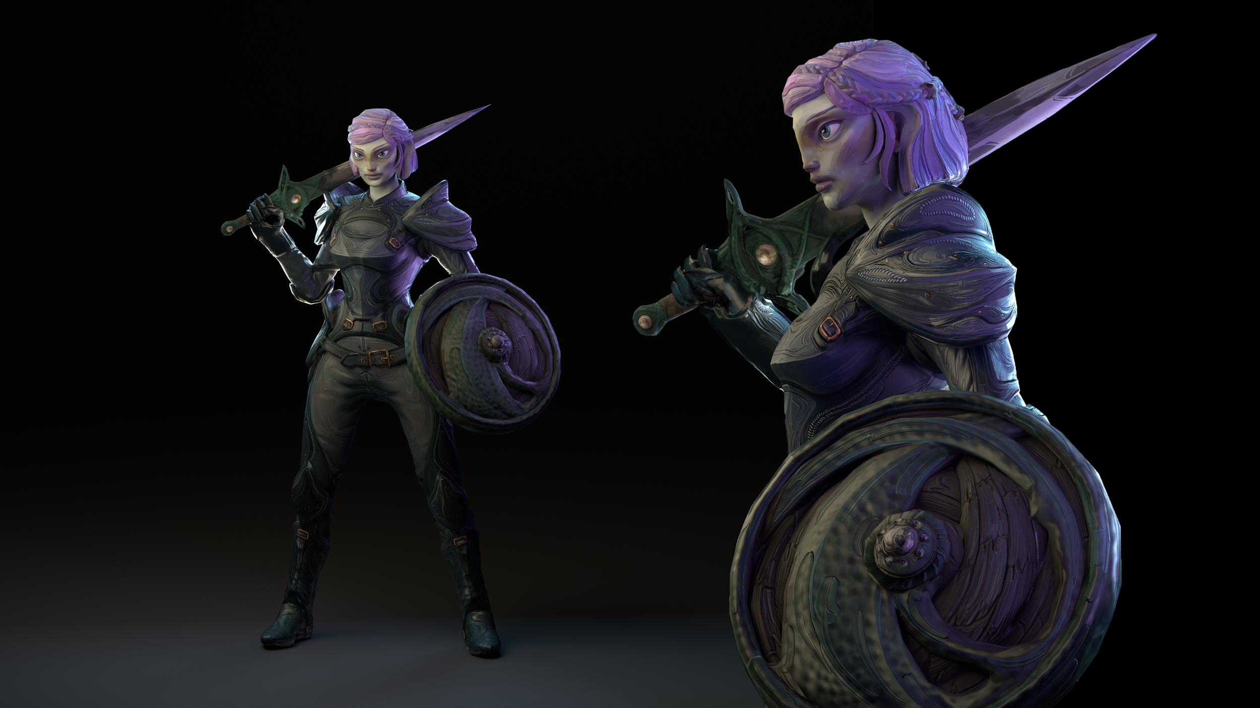
Each character has 1 base body, which is modular & morphs to different body types. We created 5 alternate heads & skin tones, & infinite facial morphs for full NPC variability.
Each NPC had to feel like a distinct person with minimal effort on our part; since we generated thousands of persistent people. They also had to show emotion on their face, since our system had over 13 mood states that affect NPC behavior. Mood, as a mechanic, must be immediately visible to the player in a meaningful way at every level of our art direction. (UI, Animation/Posture, Facial expression/Morph, etc)
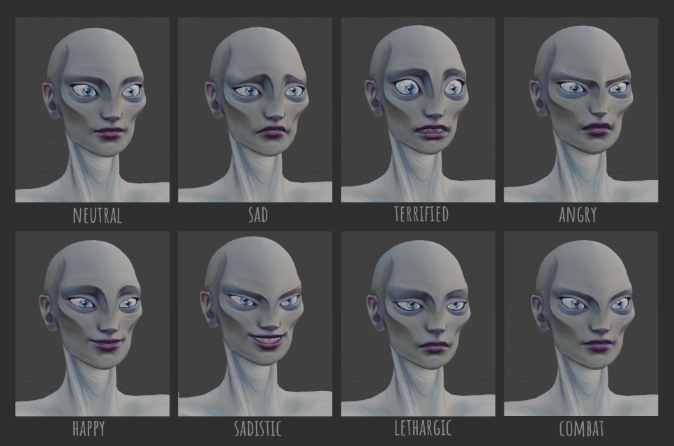
Our 3D Character artist Ariel Andrisen made over 36 emotion states; each one tied meaningfully to gameplay & visible from far enough away because of our exaggerated facial proportions.
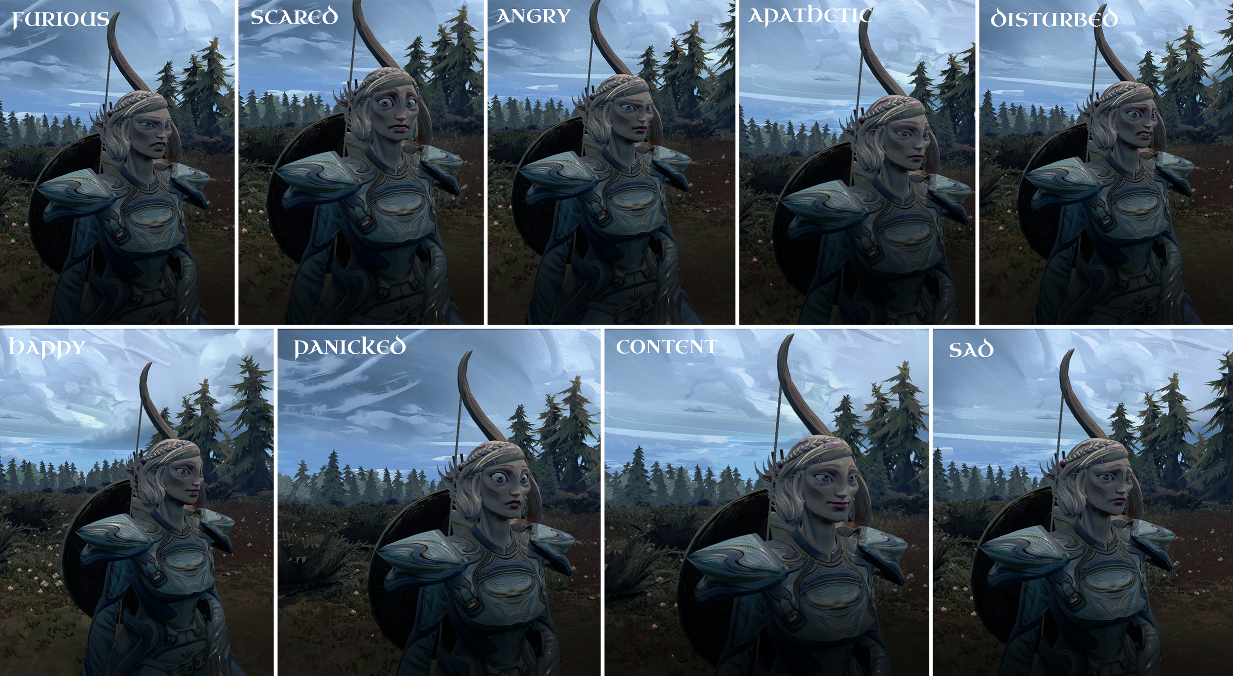
She also created 5 alternate heads - 3 shown below, which can be shown with any of our 5 skin tones & our infinite facial morph spread to create a full variety of npc types. Morphs not shown here.
We have a western African inspired head type & Mongolian as well. Beautifully conveying many different ethnicities was an important cornerstone for us. There’s nothing more annoying than entering a character creator & being unable to create yourself because the culture has no conception of what an afro is.. or twists.
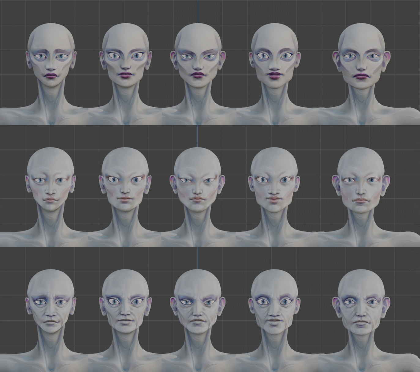
It was important as well that most of our NPCs fill out average attractiveness metrics; with beauty being rarer & often correlating to heroes in game. While that’s not my favorite choice, it’s the choice that most media falls into for important reasons. (Think of your favorite anime)
CLOTHES
The clothes in our game are highly MODULAR (sleeves can be interchanged on all, & each piece can be recolored). This way, we get MANY different shirts out of the combinations of each sculpt.
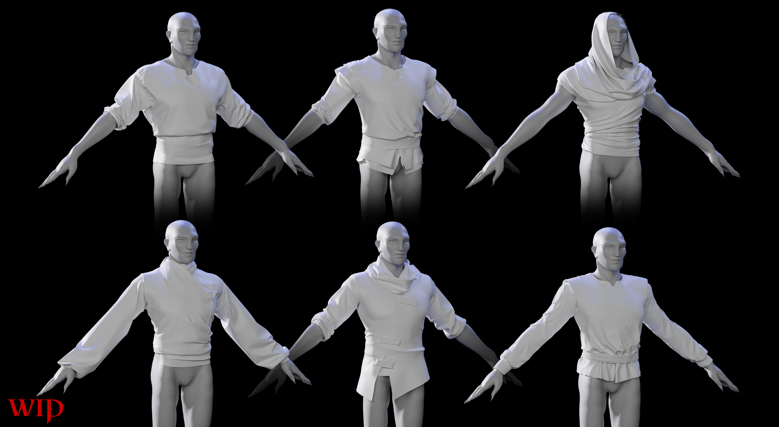
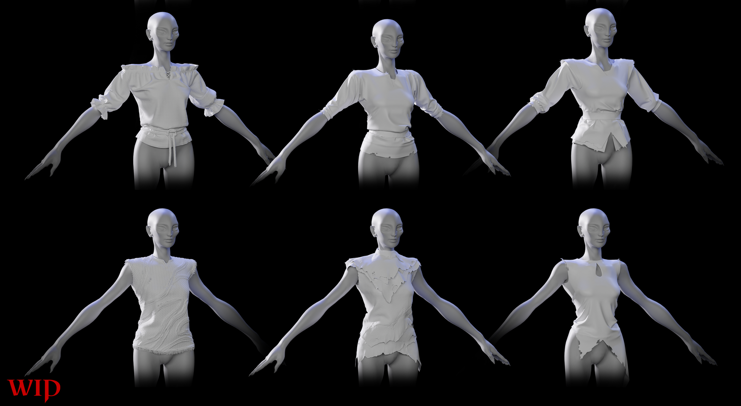
They were designed by Leah Mcallister & Ariel Andrisen to create NPC fillout: to make the world feel lived in by a diverse range of people.
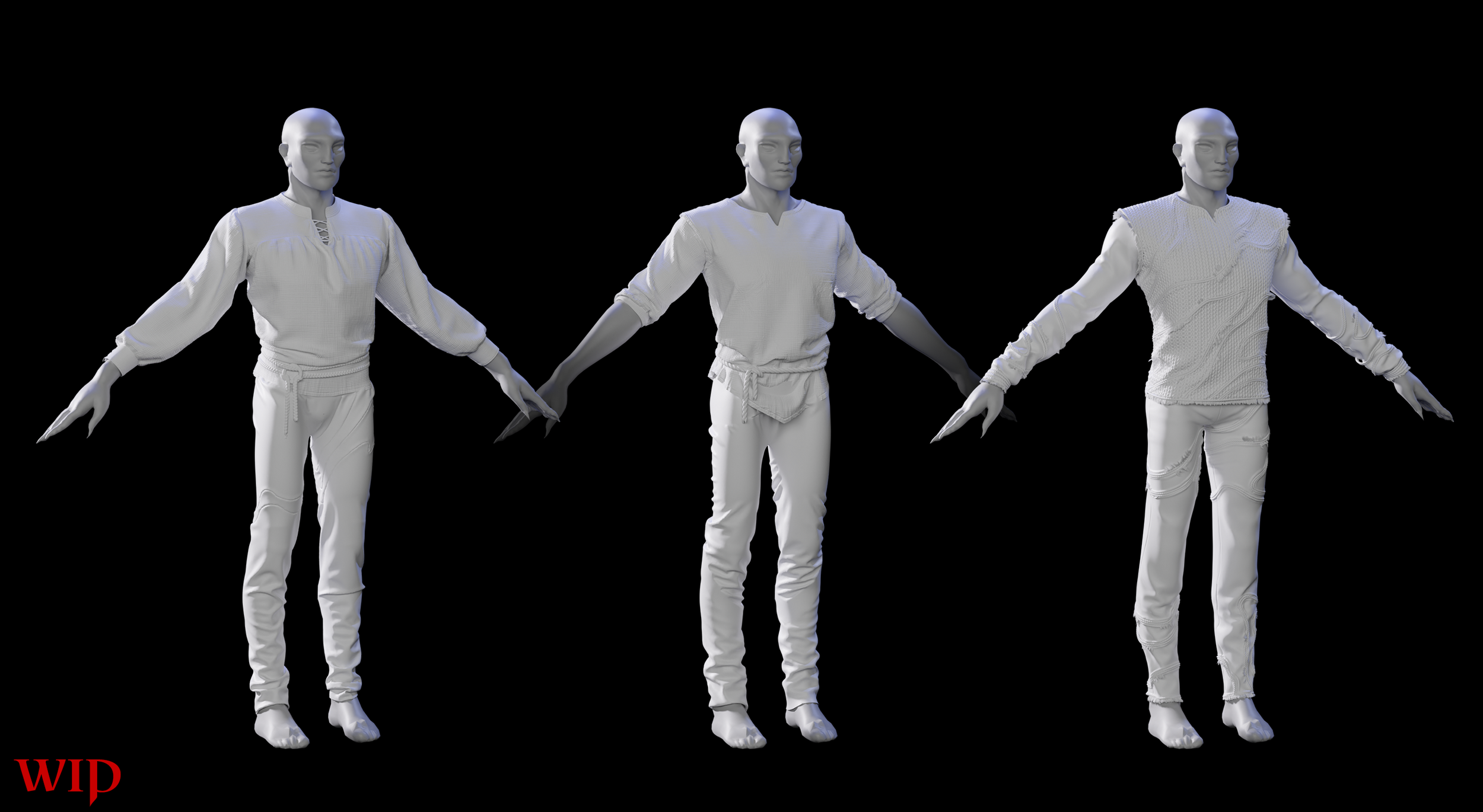
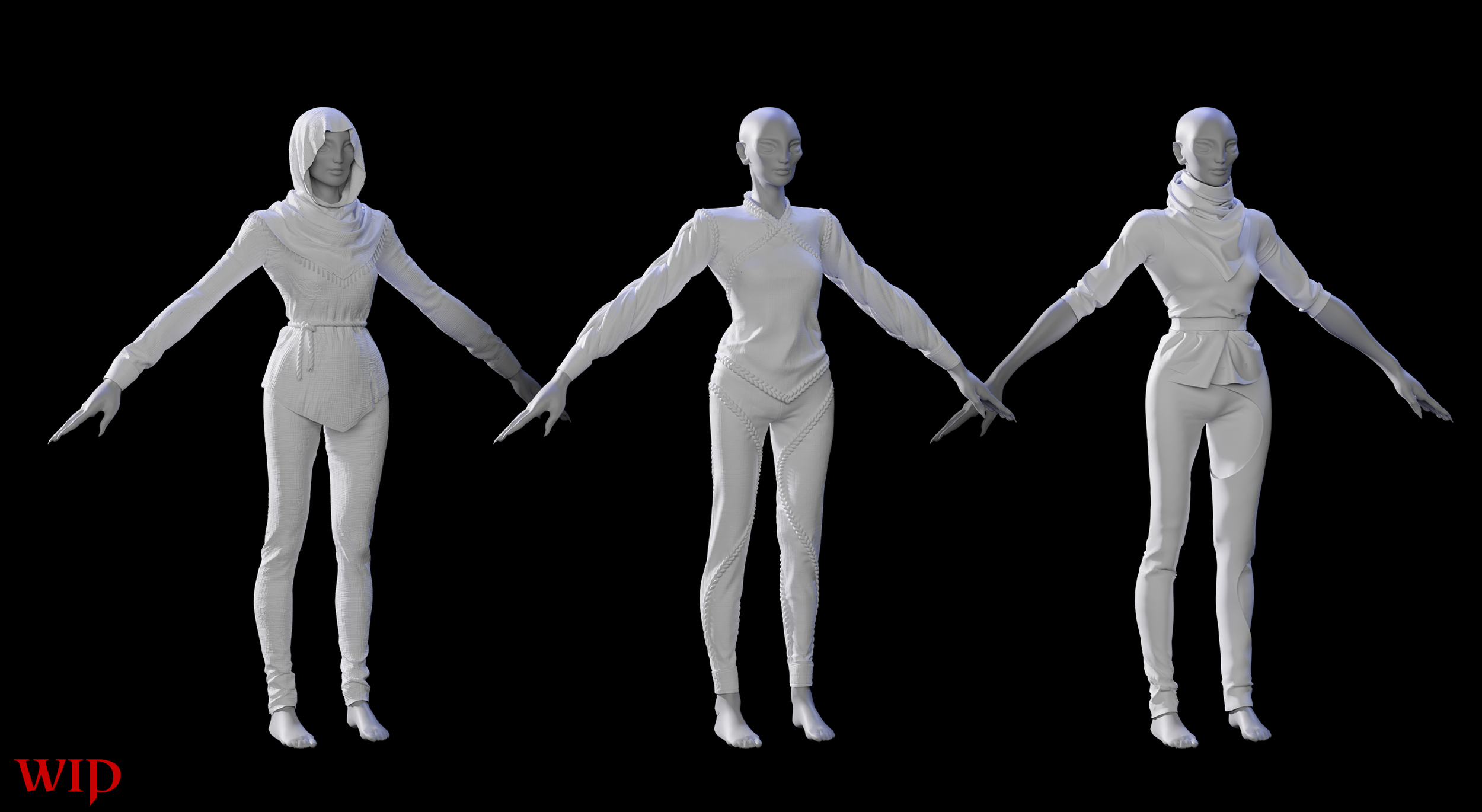
This first pass was to fill out the average poorer folk of our world - the next step is to define trade appearance (smith vs farmer) & then our heroic focal points.. great merchants, priests & warriors.
PROCEDURAL MODULARITY
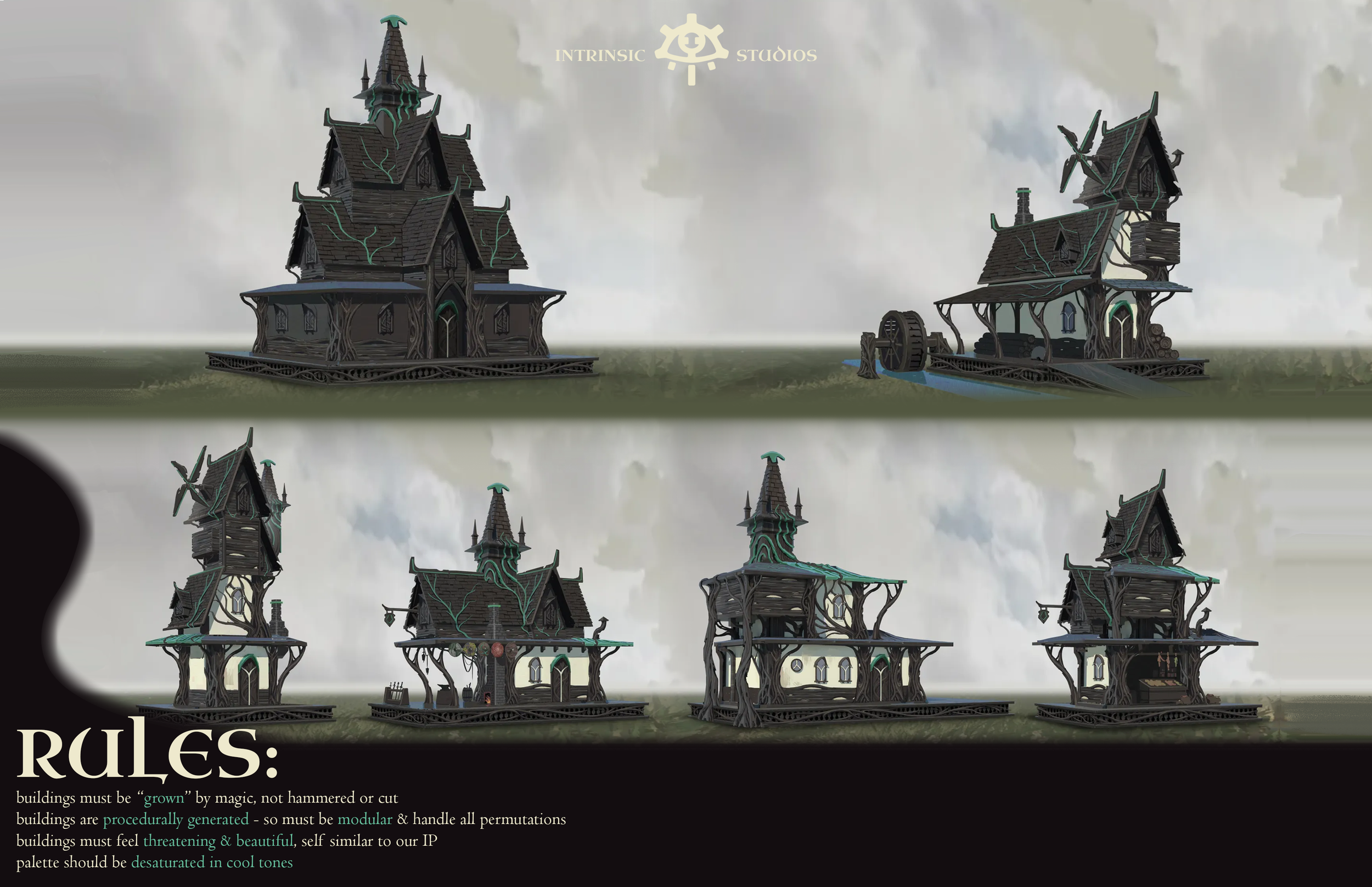
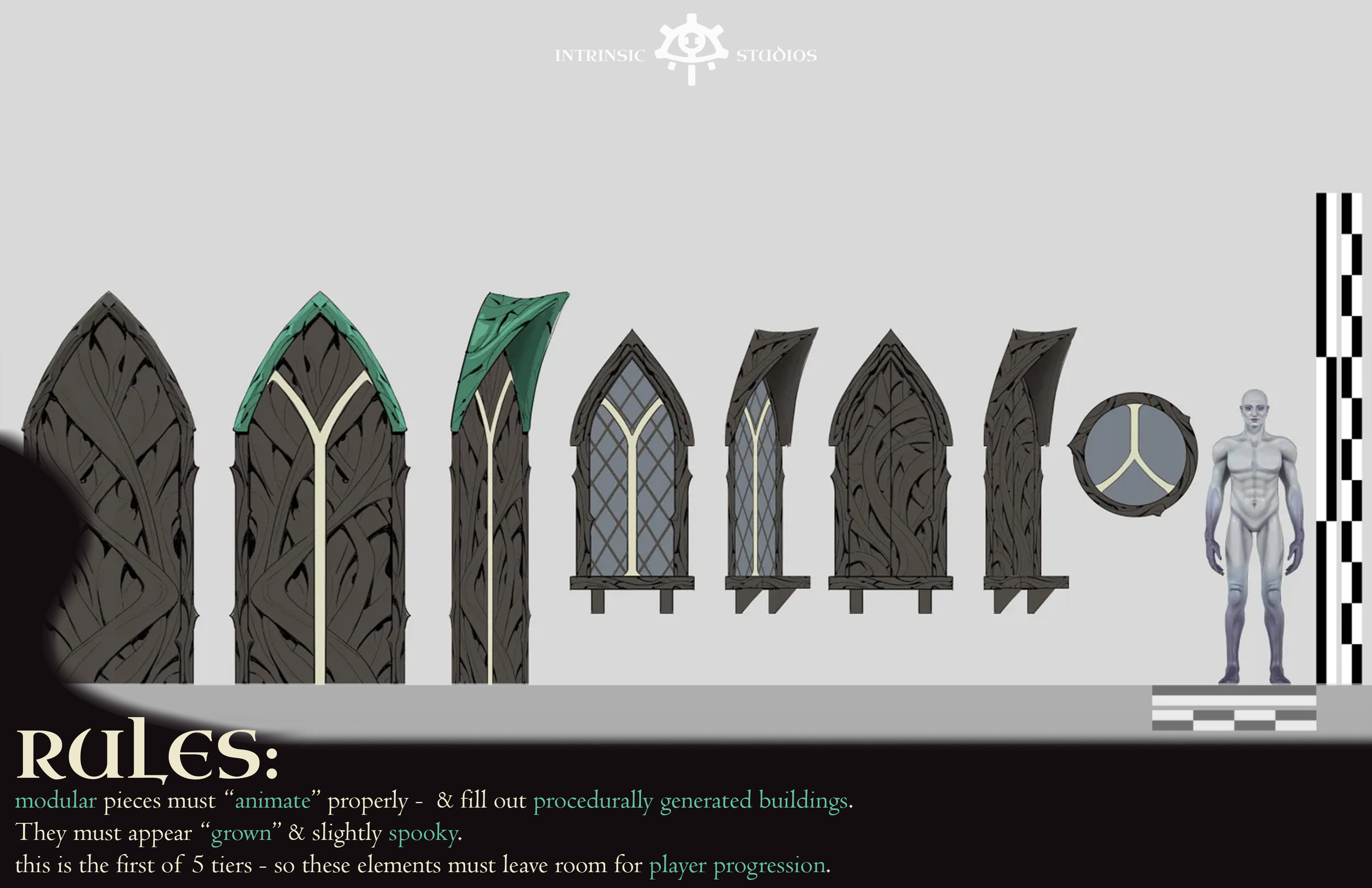
Concept Artist: Gary Chen
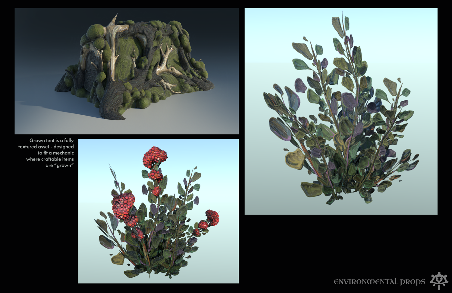
Every crafted item or building in the world of Chernobog is grown, not built. By establishing rules like this, you can unify & develop iconic IP quite easily. There are no boards, no hammered nails. Instead, metal grows between nouveau branches & laces it together.
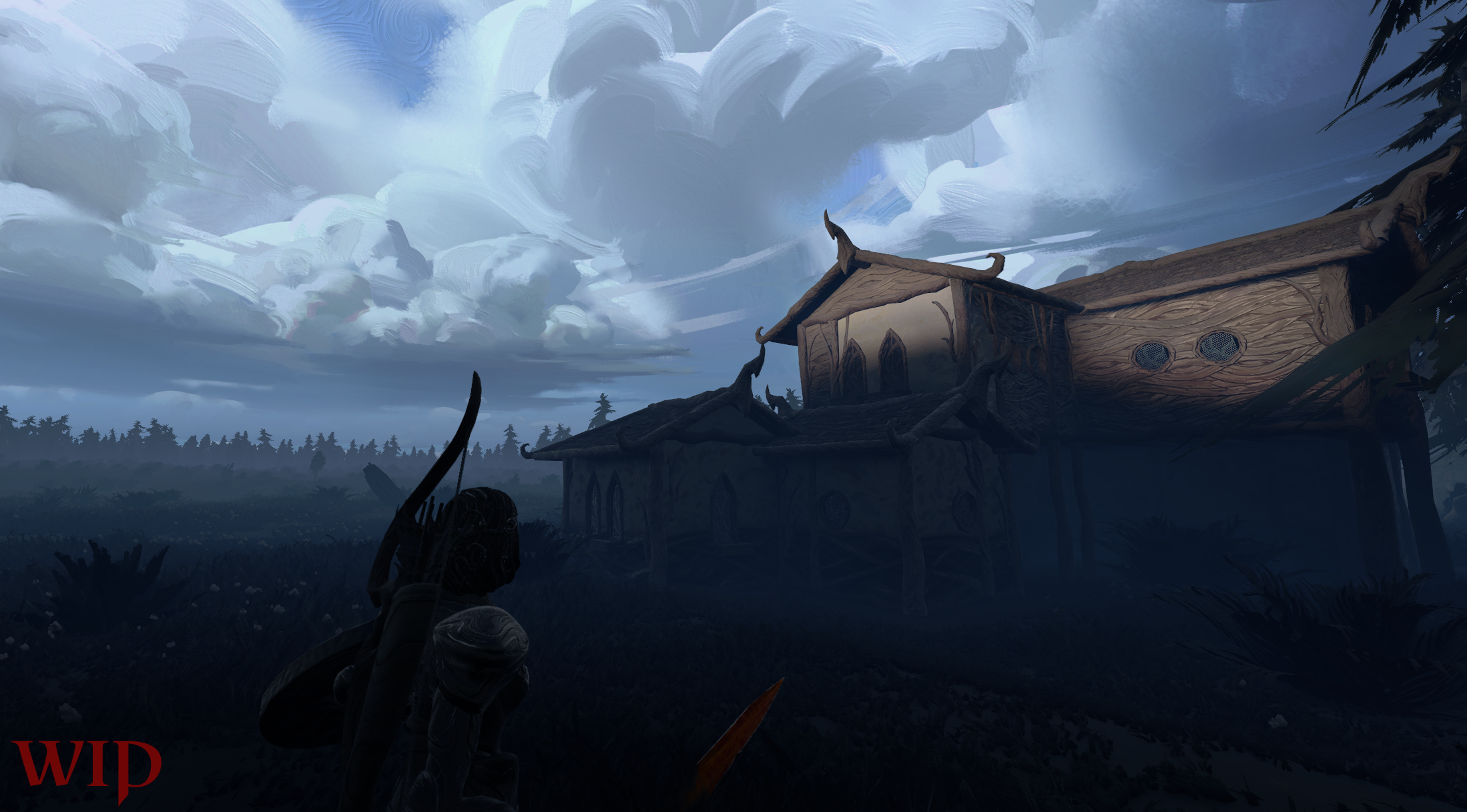
Our buildings are procedural, which means we’re fighting the algorithm to create beauty & natural flow. Each piece was designed modularly to generate many potential buildings- & each one is recolorable using a system my team & I created to get more re-use out of each asset.
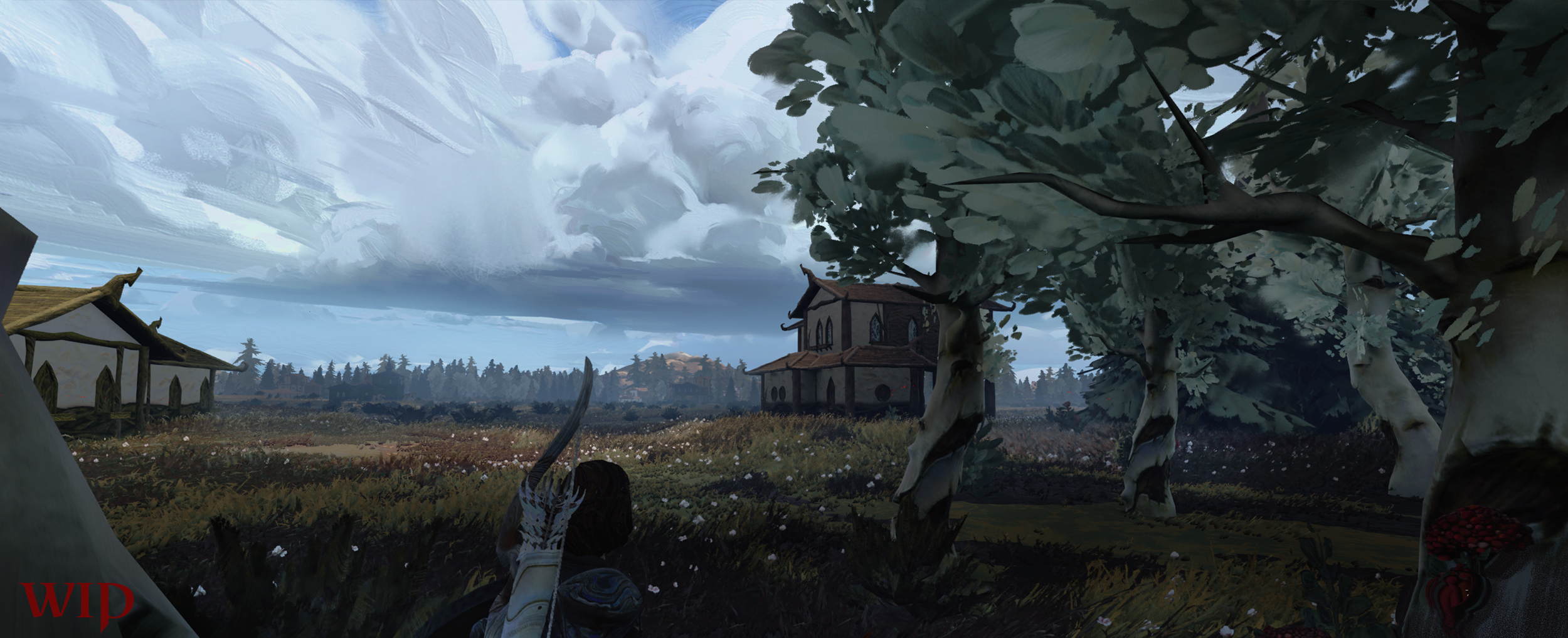
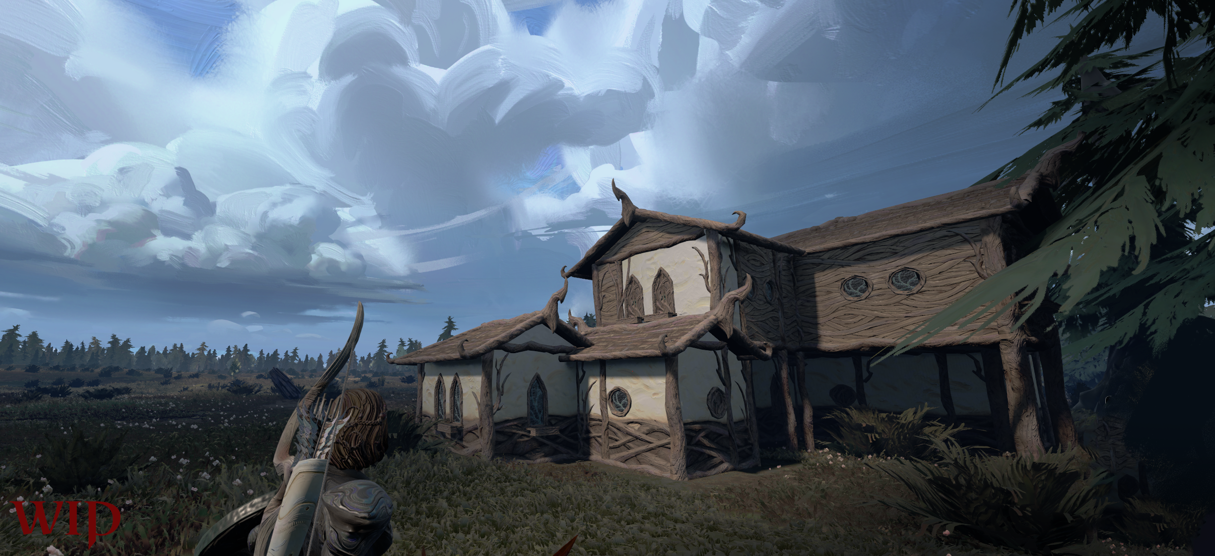
Buildings are WIP - they’re halfway done & need final fillout to get closer to concept. They generate procedurally & create thousands & thousands of path-able variants!
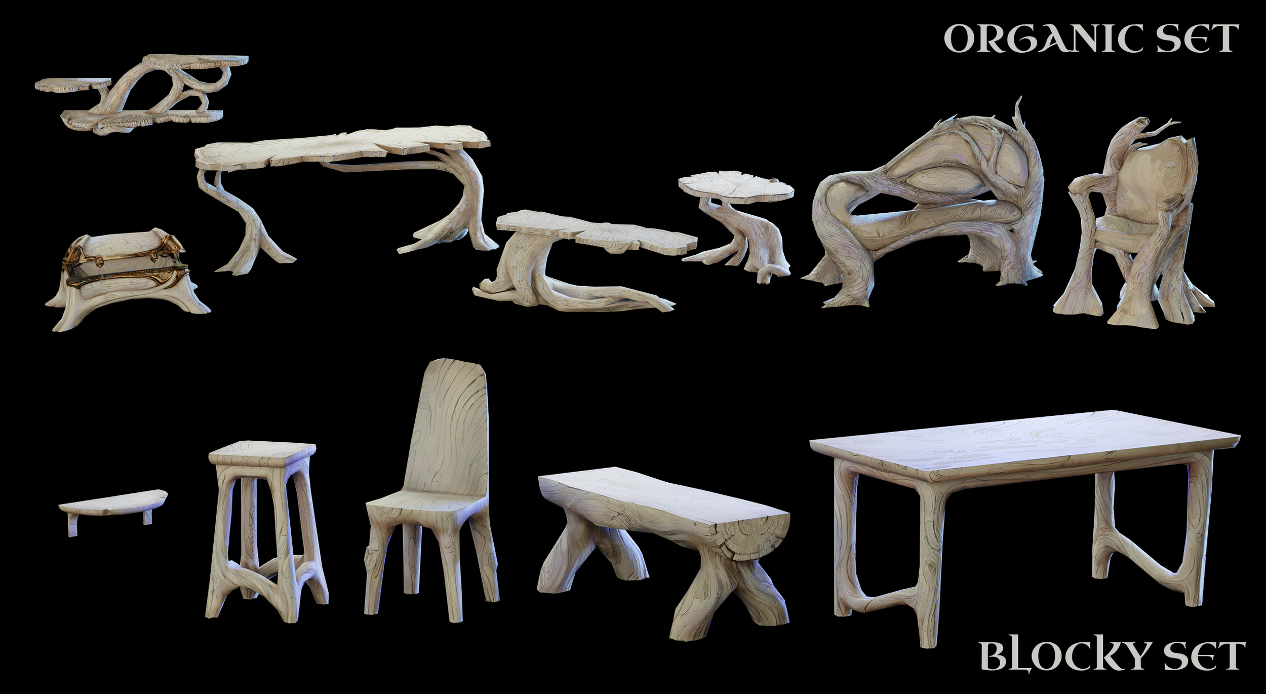
Our furniture, designed & executed on by Leah Mcallister, is “GROWN” instead of built, & fully recolorable.
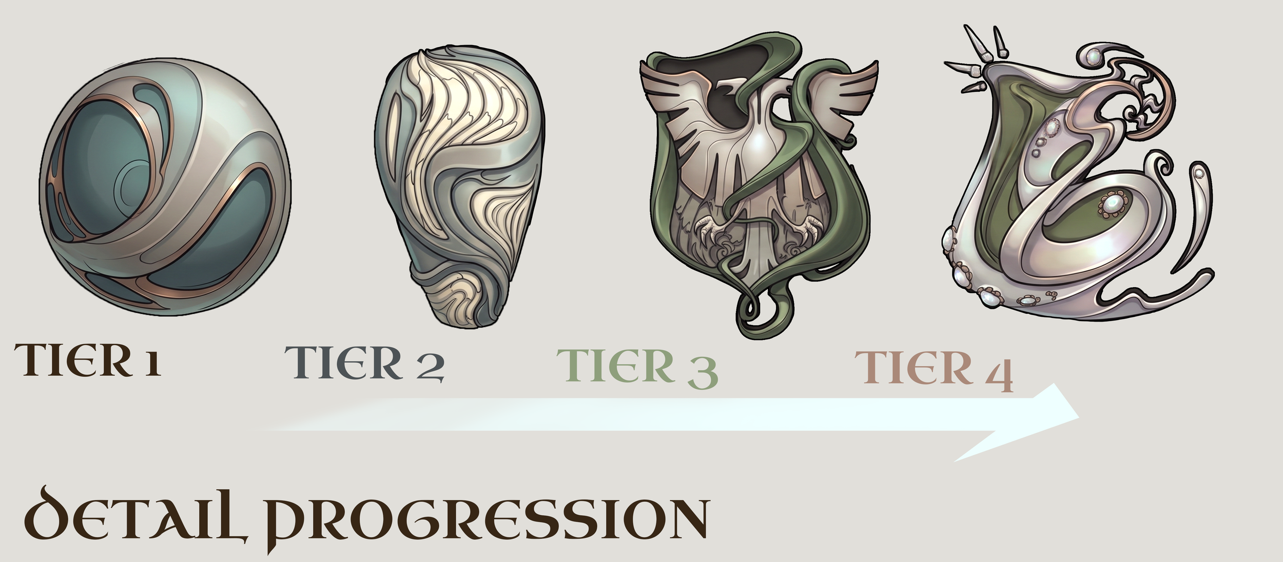
Every asset in our world is currently Tier 1- & being designed to fit a full range of player progression. By pulling back our silhouettes in specific ways (simpler forms, less high frequency detail, etc), we leave room for the player to feel they’re upgrading over time.
MODULAR ARMOR
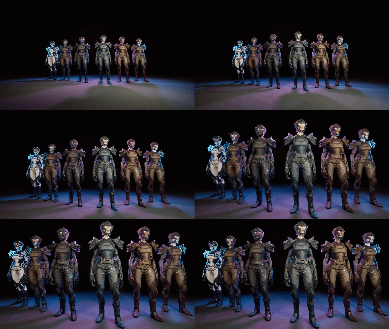
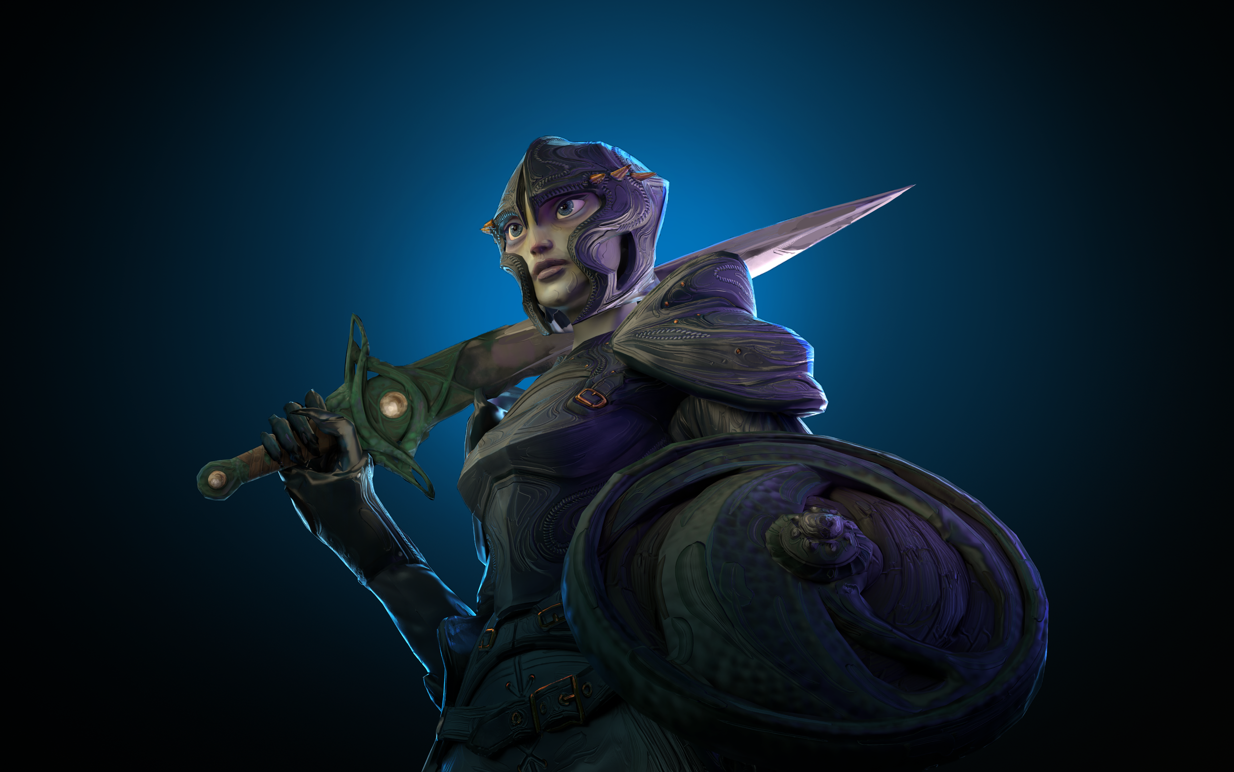
Every armor is FULLY CUSTOMIZABLE with 3 color channels - & built in modular pieces, achieving 100 different combinations out of 1 sculpt and topo set.
Heroic, aggressive & large silhouetted pauldrons are tied to hero status in our game. Therefore, when you see an impactful, unusual silhouette, you know as the player that’s meaningfully tied to difficulty of enemy or strength of potential ally.
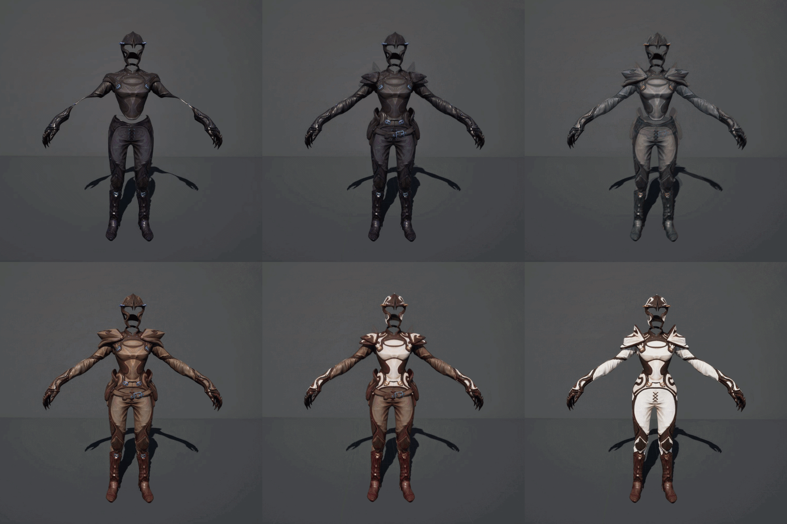
That’s a great example of how we want to convey information with the characters & armor itself, and then emphasize with UI, as opposed to ONLY relying on UI to communicate important gameplay information.
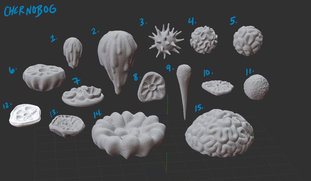
We created a KITBASH SYSTEM- where each artist could re-use smaller modular mold pieces for any asset; cutting down sculpting time dramatically for all Chernobog assets. (used on the right >)
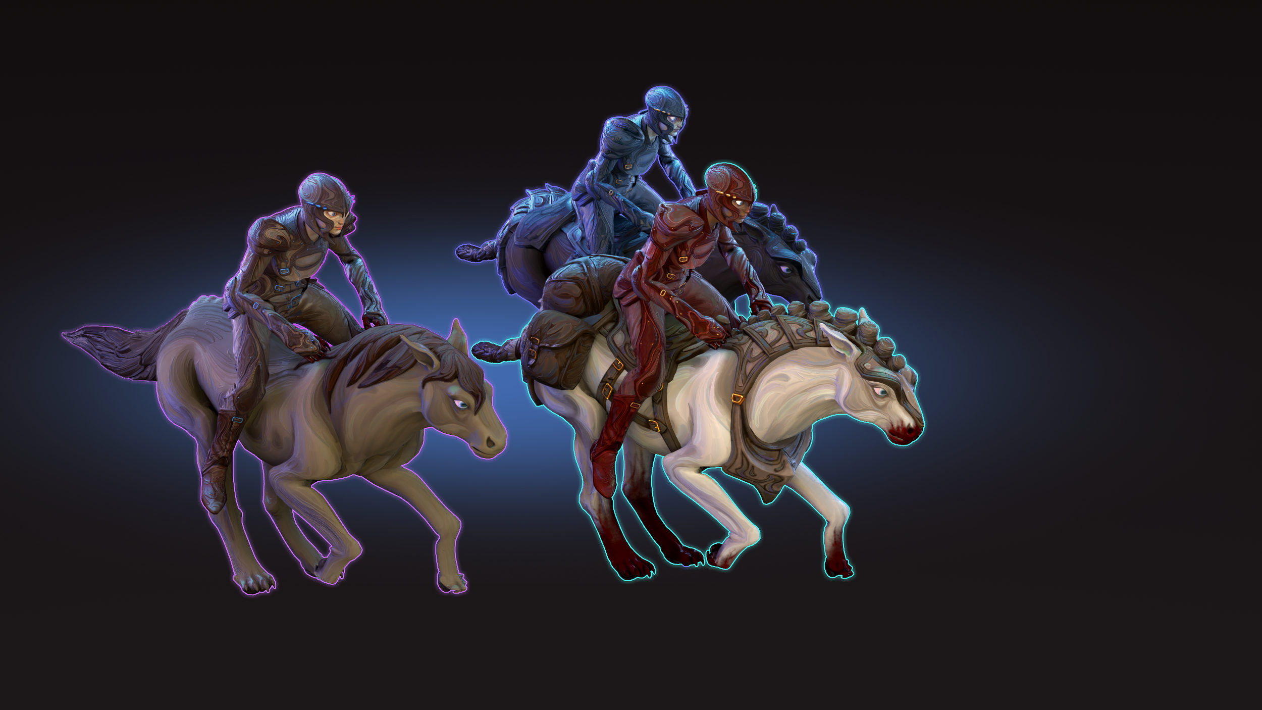
Each horse recolors into infinite tones. By using our proprietary recoloring system & painting the base horse with strong markings, as we darken the colors we “destroy” the markings & create a range of full-color horses vs marked, without any additional textures.
Horses have wild hair vs tamed, and each is a separate mesh item.
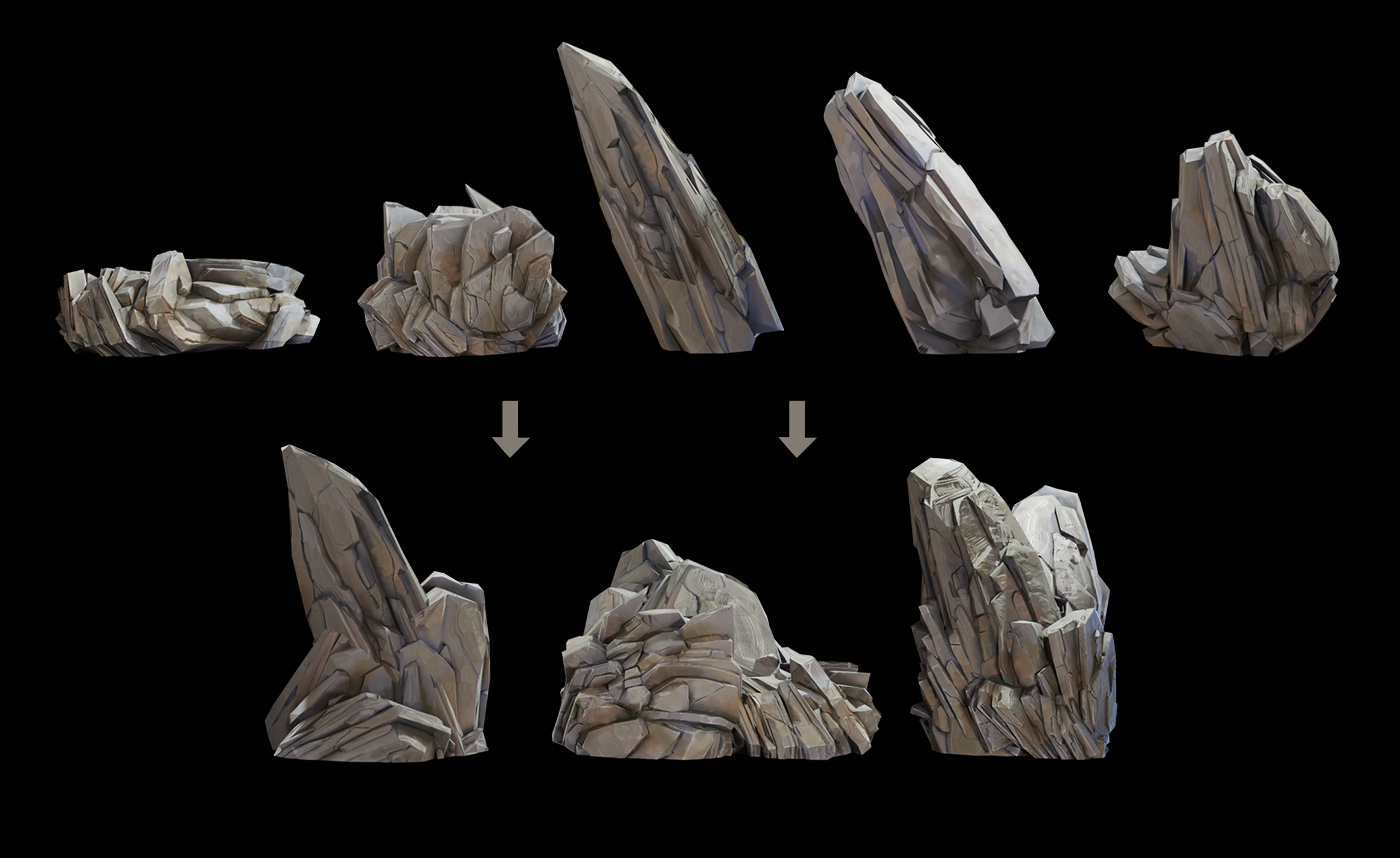
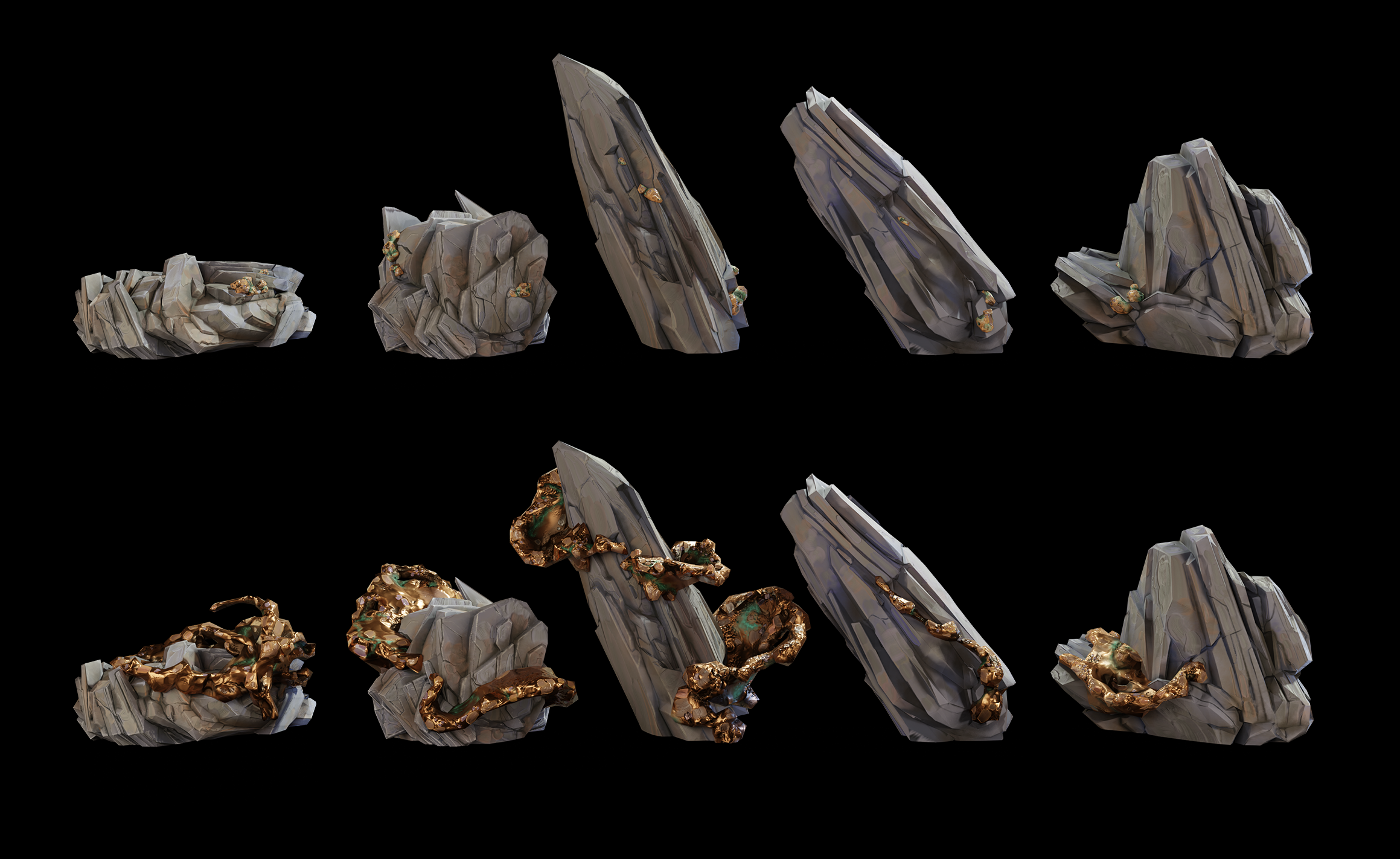
Our slate rocks are built such that we can combine & rotate to get many more “impressions.”
They grow from nubs into fully grown slate, then grow copper nubs, & finally their full copper.
ANIMATION
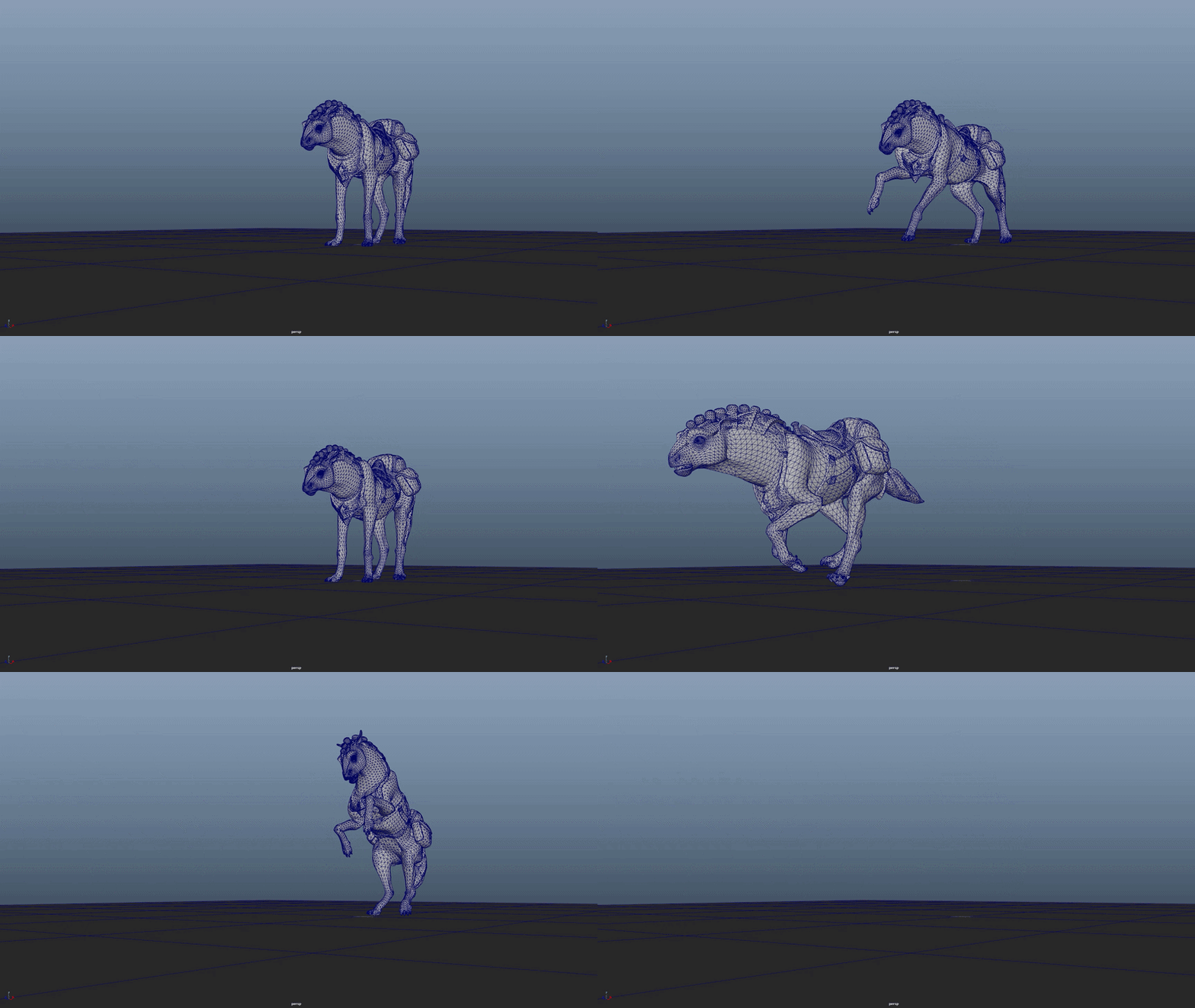
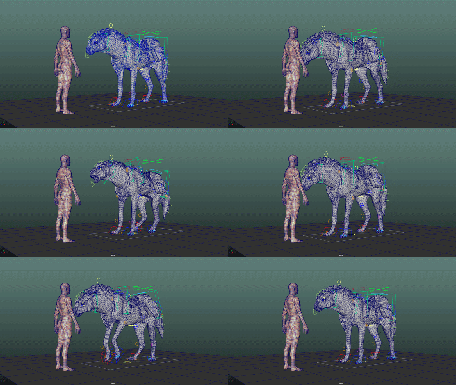
Our horse was animated like a cross between a real horse, & a maned wolf.
Everything in our world is slightly off.. slightly more PREDATORY.
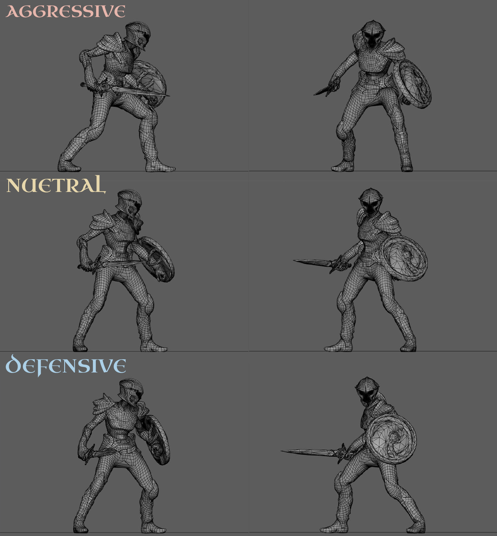
We started by defining 3 BASE IDLE POSES - Aggressive, Nuetral & Defensive, to help the player visually distinguish between the 3 large categories of enemy NPC behavior.
Despite having range between the 3- the character appears POWERFUL, BEAUTIFUL, & DANGEROUS in all cases.
We referenced DANCERS for almost all of our human animations. Movement should be graceful, more beautiful than its natural form, idealized.
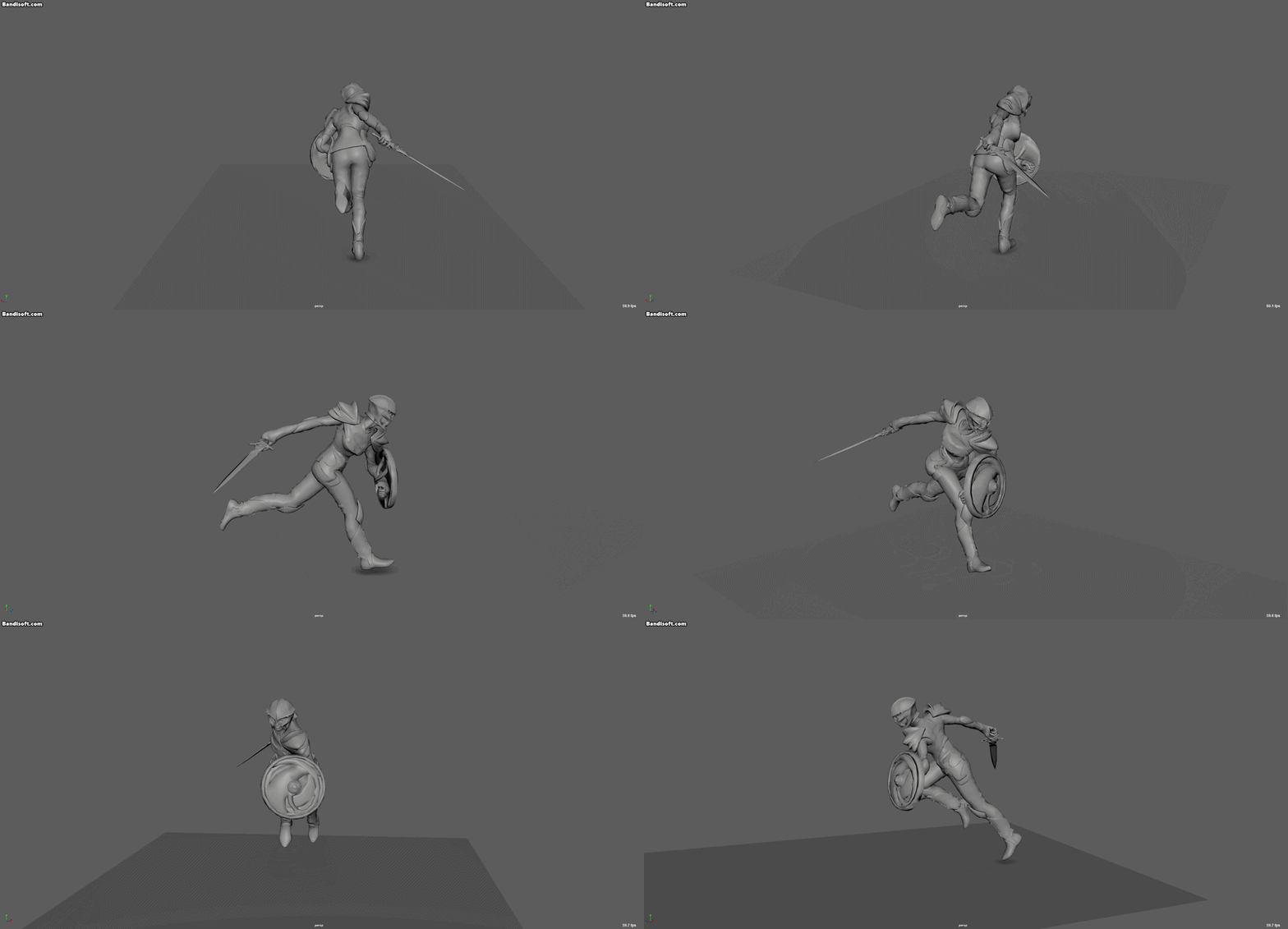


We designed our NPCs to read as “EMOTIONAL” at first glance.. not just through UI color. That meant someone who is scared in battle, would shake & hold back. Their behavior is affected by their mood state, which is clearly communicated in the animation.
VFX
The VFX in our game is painterly & stylized into traditional art themes. Heavy emphasis on refraction & precise timings.
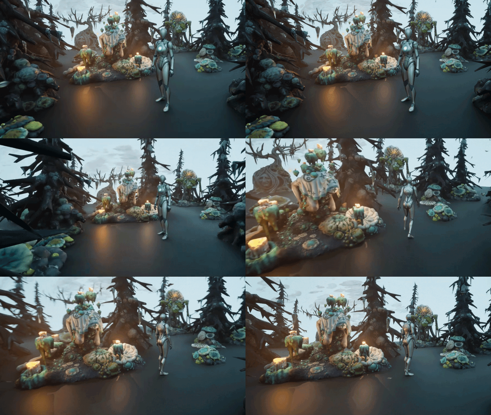
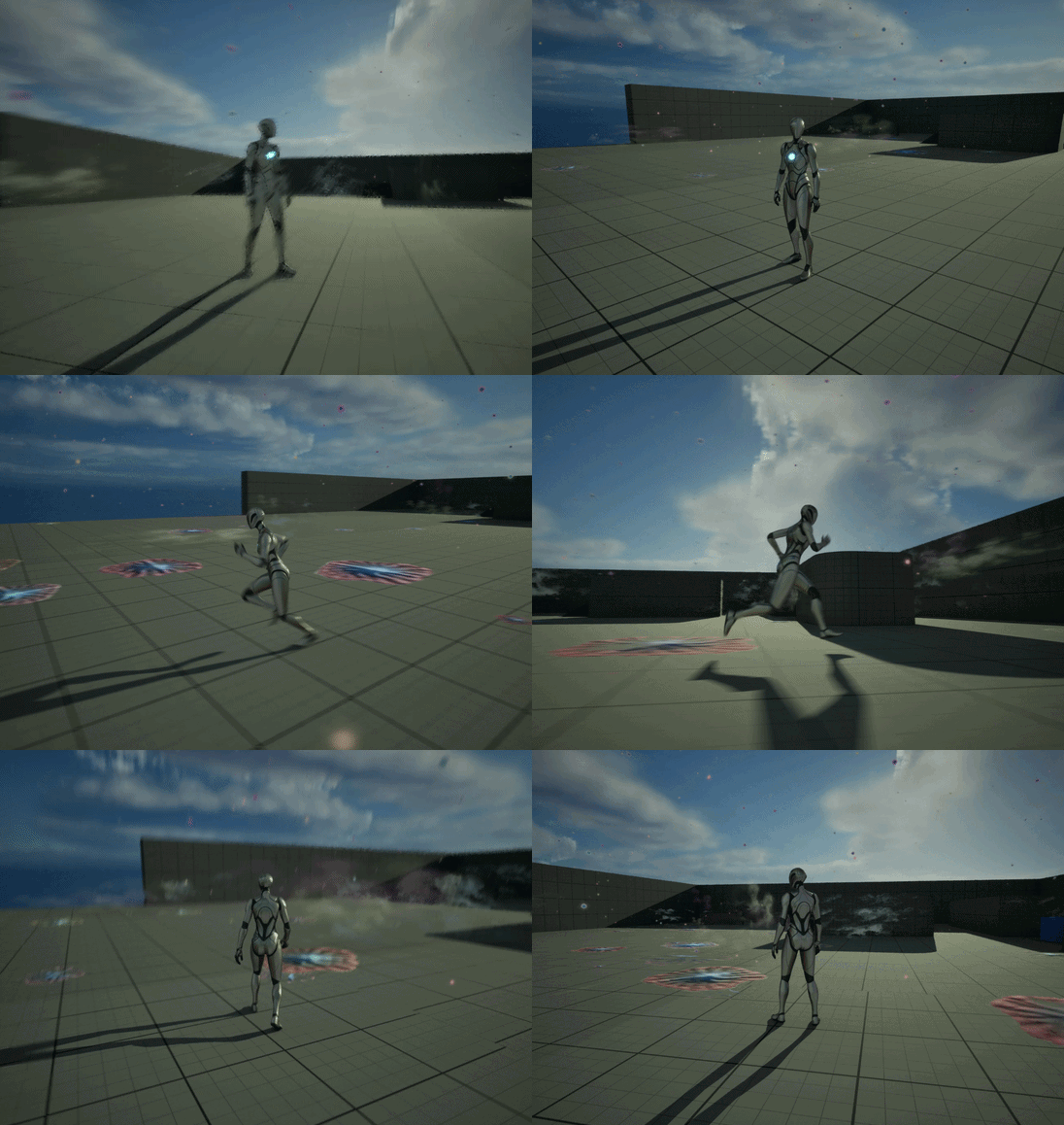
Butterflies! (testing in unreal, implemented in our proprietary engine)
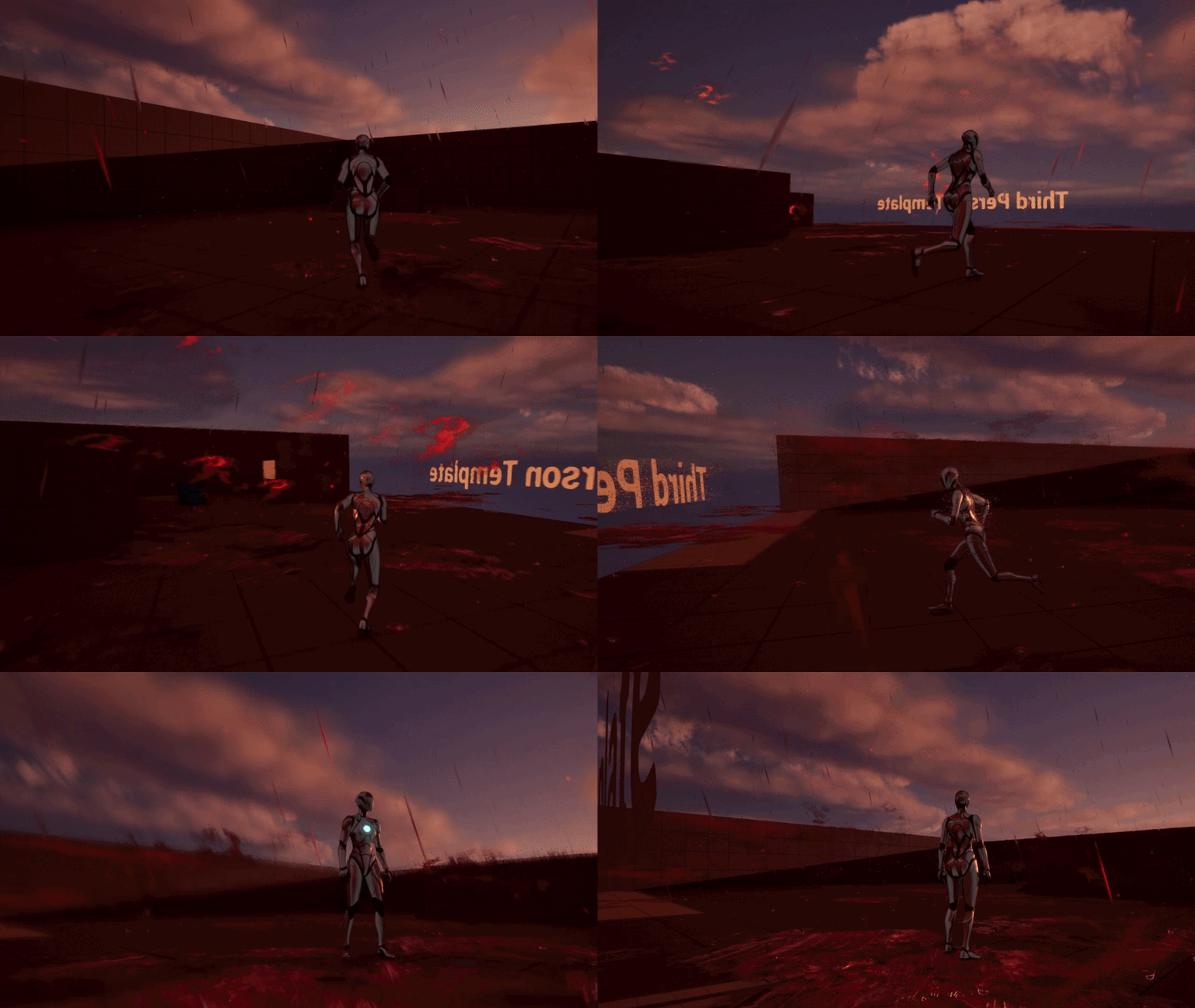
The blood rain in our game slowly accumulates into thick impasto paint strokes on the ground!
(tested in unreal but implemented in our proprietary engine)
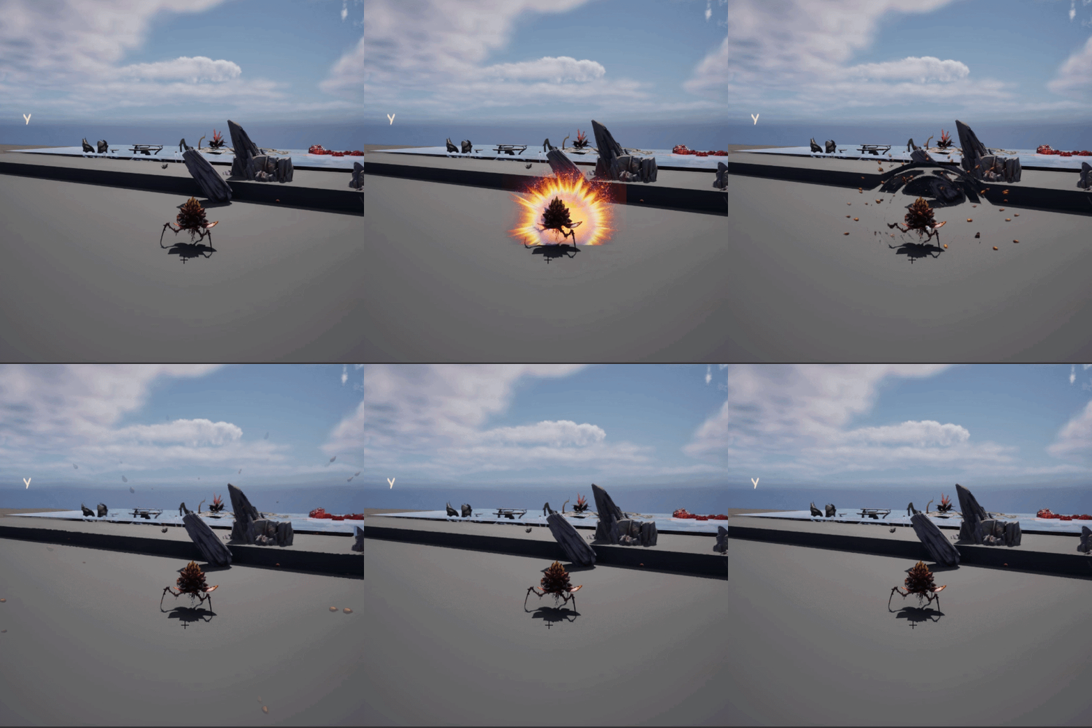
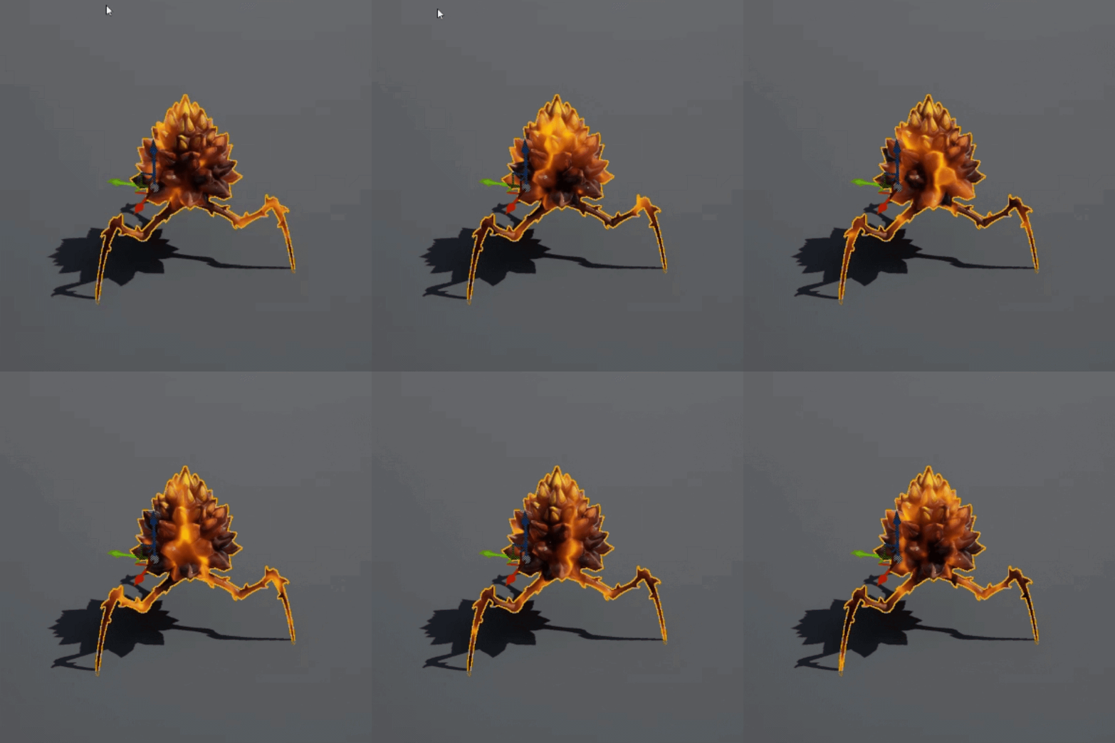
WIP VFX - mineweed will chase player, glow, shake, & explode on impact after jumping at you
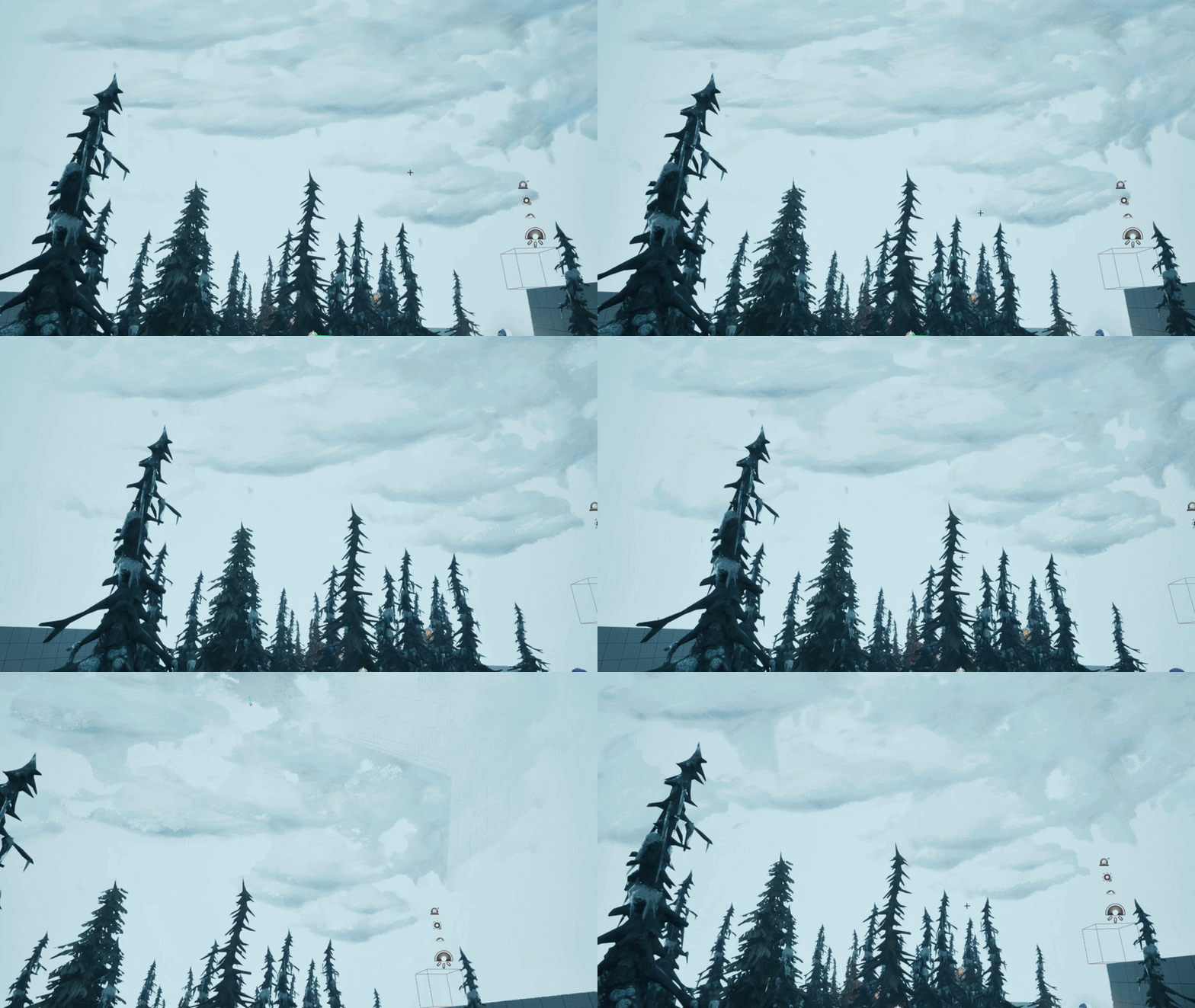
Painterly clouds in progress
UI
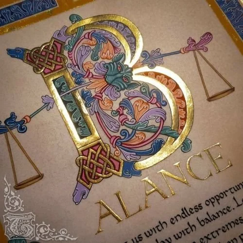
The UI is currently in visdev-
We’re aiming at Medieval UI, using FIRST PRINCIPLES REFERENCE: as though all of the UI was lovingly created by a SINGLE MONK locked in a castle somewhere over the course of a lifetime.
The UI will have the WIDEST VALUE RANGES to contrast the less contrasty Env Art.
MUSIC
The music was designed to fit our 2 themes: Banshira & Chernobog. We went back to first principles & research real medieval instruments; hand picking the unusual ones that could help us create a strong sense of time & place.
This music is conceptual only - in our game, we’re leaving a lot of space for the player so they aren’t overwhelmed.
Thanks!