ART DIRECTING UI / UX
READABILITY & ILLUSIONS
UI, while it’s great if its beautiful, needs to be EASILY READABLE & INTUITIVE. Great looking UI can still be frustrating UI (See Marathon)
We also are fighting against many cognitive illusions, and different cultures have different illusions.
A great example is the illusion seen below:
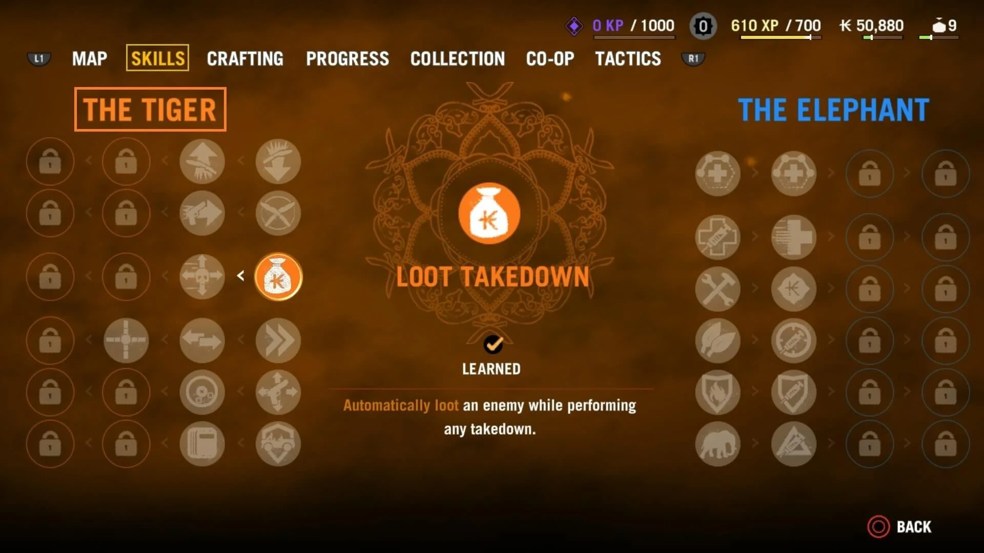
In this above example (Far Cry 4), they expect the player to read left to right, but because the shapes are similar and sorted into vertical lines, our brain reads these lines as “vertical” & we expect to select skills as such. I learned this from Celia Hodent!
There are many many other illusions - one of which is that the further UI is from your eye’s focal area, the larger it needs to be to be readable.
UNDERSTANDING THE HUMAN BRAIN
There are a few great examples (also learned from Celia) of how the human brain impacts our perception of UI. One of them is player facing mini-maps being our typical preference, as opposed to direction-locked. The reason we prefer this, is because rotating shapes in our heads is hard. But not EVERYONE prefers this, so giving players the option to swap between modes is important for eliminating potential review-bombing.
There are many other examples, like priming & conditioning (events consistently preceding other, specific events affect our perception of those final events) that also lend themselves well to understanding UI/UX - but for the purposes of brevity, I won’t cover everything here.
CONTRAST
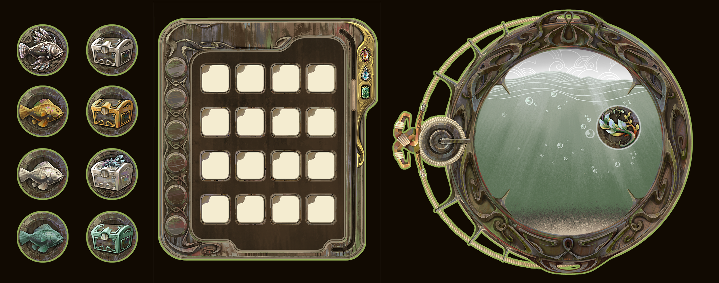
The above example is early UI for Chernobog, & while it fit our overall art theme by referencing Art Nouveau, but we scrapped it since it blended in too much with the background, wasn’t contrast-y enough, & therefore was bad UI.
Great UI should CONTRAST the environment art by using a wider value range, should utilize common HEURISTICS that players expect, & shouldn’t innovate for innovations sake.
CONSISTENT MESSAGING / COLOR
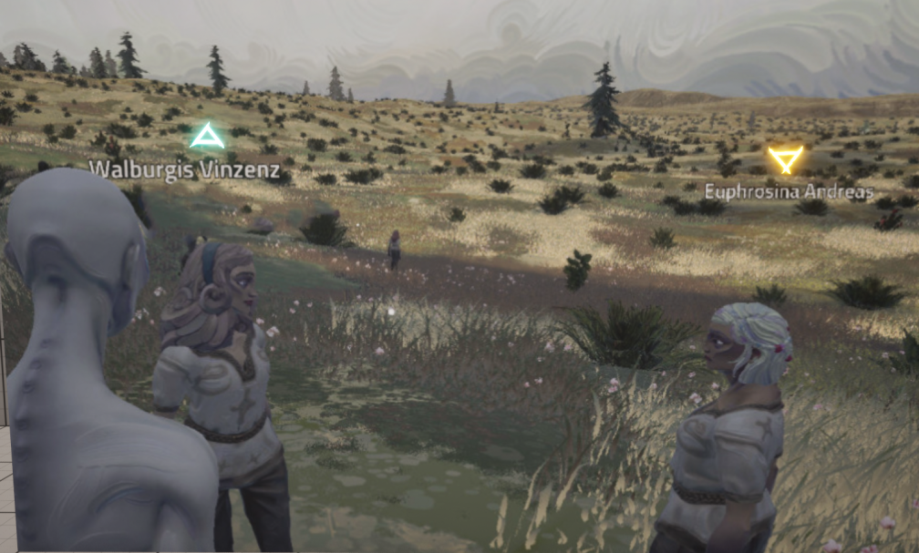
If we’re going to use a color to mean something specific, we should endeavor to keep that consistent throughout to reduce player frustration.
GAMEPLAY INTERACTION
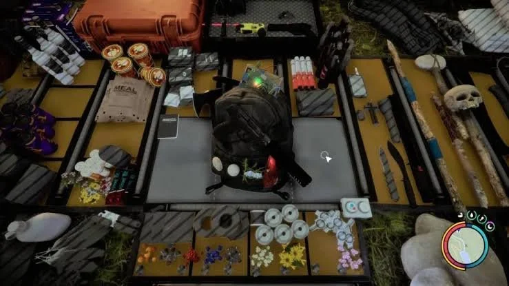
The Forest 2 is an interesting example of UI; it’s designed to frustrate the player & slow them down while they’re being hunted - & so supports the overall goals of the game.
Great UI keeps in mind the overall game pillars & emphasizes them by using first principles thinking, (within reason) instead of just copying what’s been done before.